Monday, 30 January 2012

last week in beauty

I actually want to make a general post today about the things I (re)discovered in beauty last week.


First, I ventured on Sleek blush in Flamingo, which, pricewise, was not an expensive venture. After reading many descriptions of it being terribly bright in the pan but subtle on the face I decided I wanted this particular poppy pink. Ehm, people who follow me know I'm spoiled with my high-end blush and that is my first disclaimer: I'm a blush-snob! 
To me, this one looked as scarily on my face as in the pan, probably worse because the pigmentation went bezerk on my unmadeup face (tryout). A good quality blush has the ability to look good on an unmadeup face, because the pigmentation will even out, but yeh...I looked like a kid playing with the makeupbox..
So this one can be used, only with a stippling brush/care/lots-of-time-on-my-hands. Somewhat, I expect it will end up far away in my beautycloset or I will add it in a giveaway.

Already feeling spring-like by adding lot's of pastels to my nails. Catrice is quite cheap but I really like the quality of their nailpolishes.

Another good-quality Catrice is that blue-ish eyeshadow I added. Also, I varied the safe neutrals with a pop of colour...

I almost finished my second tube of the Jurlique Purely White Skin cream. I think it really works: I already noticed this the first time when I had to correct some odd pigmentation on my forehead due to forgetting to add sunscreen that day. This time I noticed, cheapskate me, that my neck was darker than my face. Reason: I only slathered it on my face instead of the neck.

I finally jumped upon the Ellis Faas lip -hype, the glazed versions. I already have her foundation (post here) and I really liked the look of the L307 after seeing it on Kate (drivol). On me that L307 looked like a weird apricot muddy pudding, so testing is always good before you buy. Anyway, I loved to go a bit more red and I found a rather perfect red in the L303.
Ellis Faas L303
The best thing is that it fades in the most beautiful way: reds are always so dangerous with fading and they are normally so high-maintainance but this one really fades into a stain...so gorgeous.

Sunday, 29 January 2012

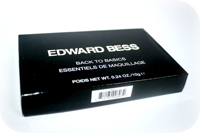
Palet-mania: Edward Bess Back to Basics

I have a soft spot for palettes. They are often the perfect way to try different products from a particular brand, are easy to take with you, and are often in the cutest box.

I kinda stopped for a while with my Paletmania: I couldn't find anything that mixes up a good match of colours nor did I find a brand I really wanted to explore. Until recently, when Edward Bess ventured on the field of palettes.

 I already tried some of Edward's products (here) and some where hits and others not so much. What I hadn't tried but was still curious about were his creamy cheek blush, his lipglosses and the lipsticks. So when I saw this palette would feature his creamy blush ánd some lipglosses I was almost sold. They also featured more of my favourite Bess products: the eyeshadows.

From the swatches from niche beautyblogger Sabina (beautylookbook) I saw that the Back to Basic palette looked like a better choice for me than the Berry Chic one.


The palette embodies the same minimalistic chic as his other products. It really reminds me of Bobbi Brown.

Speaking of Bobbi Brown, I want to show you the difference in size and compartability, as, after all, a good palette should be handy to carry around with you:


Basically, Edward Bess is the longer and thinner version of Bobbi Brown.

I actually prefer the size of Bess to tote around with me: you can put it in a sort of sleeve or in the side-pocket of your bag. It is somewhat wallet-like.

The inside:

The palette is quintessentially like a good functioning palette with a mirror, the compartments separated, and, good extra, actually a good quality brush instead of your run-your-mill disposable applicators!


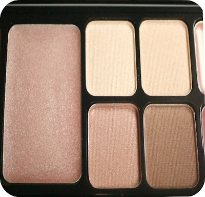
In the full view they are a selection of safe neutrals.

A closer look:
The Blush (lipstick)

This is exactly the same blush in different lightning. It was so hard to capture the true colour of this one so it is basically a mix of the two. And you will see in the swatches that it is actually a bit of a problem child to me, colourwise.

The highlighter & eyeshadows:


The highlighter looks regular in the pan, but the swatches will show that it actually has some flecks of glitter in it. The eyeshadows are beautifully creamy.

The Lipglosses:


The top colour contains some beautifully delicate shimmer and the bottom one is darker with a lovely rosy glow. Quite understated and beautiful.

Swatches: Blush/highlighter/lipglosses


The blush

I have to say I am quite confused about this blush because of it's muddy mauvy tones. When I first swatched it I thought it had a whole lot of mauve undertones so I compared it with my recent mauvy/purply purchase from Rouge Bunny Rouge, the Gracilis.

Rouge Bunny Rouge Gracilis
I can see that one is absolutely no match either, although you can see the Edward Bess still is rather on the mauve site and RBR really is a pinkier version next to it. I have to say it is a unique colour in my collection

So I am confused how I would use this colour. I find it too corps-like as a lipstick but it doesn't really benefit as a perk-me-up blush colour either.
I concluded it would be a wonderful shader colour for cooler skin-tones. Somewhat, as a neutral toned woman, I think I can use it as a shader too, only with a delicate hand.

Texture blush:
I would say it has a typical lipstick texture being a bit harder compared to other cream-blush that I have (Bobbi Brown, Julie Hewitt, Becca, Mac) so you have to spend some time blending it in. It does stay on longer, because if it's dryer texture.

Swatch Highlighter:
It was not what I had in mind...I think the glitter doesn't do it any good. Otherwise, it would have been a delightful rose-based creamy tint.

Swatch Glosses:
The glosses are the unexpected hit from the collection, especially when I read that thenonblonde and Sabina were both dissapointed in them. I absolutely LOVE the colours and I believe the creaminess is one of the best and the smoothest I have come across. It makes me really curious for the full-size lipglosses because if both women are dissapointed in the palette-glosses and they tried the real size before, than that one has to be even better.

Swatches: The Eyeshadows:
.

These are my absolute favourite of the palette. The texture is so wonderfully soft and brings out a glow on the eyelids. My favourite are the two lighter colours. Colour 1 to be a buttery, somewhat yellow toned cream and the second one a pink hued cream.
 The 3rd colour is a rose-toned brown that is excellent for bringing out a slightly different hue in hazel, blue and green eyes, so I love it for it's neutral quality ánd being able to make the eyes stand out a bit. The last colour, the darkest one, is a lovely neutral brown with slight shimmer to make it come alive. So lovely for shading and a soft eyeliner.

Conclusion:

This palette is absolutely travel-worthy on trips that are based in the winter or colder cities (or when having a paler skin colour) and I can see it working on tanned skin as well (for example Sabrina again) as the neutral no-makeup-look essentials. 

Some textures/colours surprised me in a good way (the lipglosses) and some were not really my thing (highlighter). I really like the fact that the eyeshadow/lipgloss brush included is made of higher quality hairs so the brush is a big benefit as well. I think the price is quite normal/good for a travel palette because the brushes are good and Bess didn't compromise on the quality of the products as some of the palettes of cosmetics brands sometimes do (cough MAC).
I bought it from Zuneta and if you buy anything from them don't forget to add the ZBEAUTYBIBLE code for 10% off.

Friday, 27 January 2012

The Beauty-Closet Find & Something Necklacy

Have you ever bought something from a Limited Edition but haven't found the courage to touch it? So you stashed it deeply into your beauty closet?

Well, I have, and it really feels like shopping in your own stash when you find a gem...

Let me introduce my Shu Uemura by Mika palette. This one even has more special memories because I bought it in the winter 2008 in Paris in Le Printemps ♥


The colours, oh la la, I really like them all and I can say that the quality is still quite good, even after being stored for almost four years. He he, perhaps we can call this the beauty-deadstock vintage find (deadstock is vintage that has never been used in clothing terms).

Colour No. 3 is actually another illusive peach I am craving at the moment...

And yes, I finally used some of the colours...finally!

I also bought a necklace from the sweetest seller who especially listed it for international shipping after I asked it


This is the sweetest thank-you note! 


I actually wanted the necklace because of the tribal form, ánd because one of the stones is made from Labradorite. (It's from ArtifactsEtCetera).

Now I feel a leeeeettttle bit spoiled....

Thursday, 26 January 2012

Kose Addiction eyeshadow Tiny Shell 059P (spring 2012)

About a week ago I talked about my delight of seeing the softer and peach-inspired colours of the new Spring collections in makeup.I have still been modest with buying newbies, wich was in some cases a mandatory thing and you know why if you read my mid-weeklies of yesterday  ("~")

But I caved with one thing of Kose Addiction line


I kind of liked the idea of a summery instead of spring-like summerlook and their Sandcastle release has this kind of dreamy atmosphere.


 I often wonder why a cosmetic brand chooses for a specific face: Kose Addiction, something I talked about before, often chooses quite Western looking models. Ok, Western is a wider concept these days but I mean the run-of-the-mill beachy blonde types that are supposed to be really Western. This model had some wonderful intervention from her hairdresser to get a sort of buttery shade that matches the sand-dune idea so this time it makes a bit more sense. I also see that her face is a bit wider and her eyes are a bit slanted so she might either have a tendency to look a bit Asian (another big concept for so many types).

I only went for the most-anticipated personal makeup musthave, and that was the perfect peach eyeshadow. I saw a colour that had peach in it with the delightful name of Tiny Shell, so I picked that one.


Ayako, the makeupartist that is the hand behind Addiction, 'escaped' from NARS to launch his own line. The line still has some NARS-like elements in it, for example the black packaging with the minimalistic name on it.
What he doesn't do, Hurray, is the crude name element that Nars love to add at his products. He he, I'm certainly not the only blogger slightly blah about his names. Ayako, instead, sometimes hints towards sexuality and I could certainly see what 'tiny shell' could implicate besides of the Sanddune theme, but it is also easy to absolutely not notice this at all. Also, Ayako really likes Lady Gaga, because he has an eyeshadow called 'Bad Romance' (a stark matte purple) and I think he launched 'Pokerface' lately.

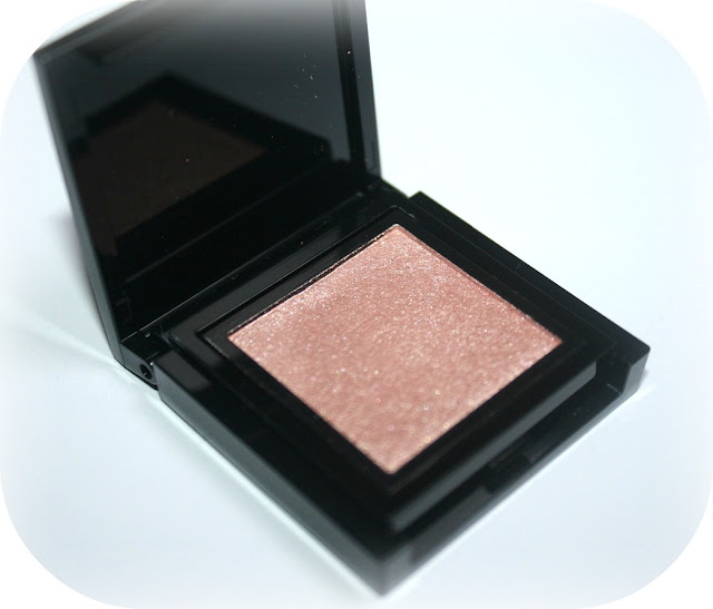
 Tiny Shell absolutely has the shell-like quality when opening it. It is a part of his P (pearl) collections, so the whole pearly pinkish peach colour is there.
(notice that the eyeshadow doesn't have a mirror inside)

Somewhat a Bobbi Brown Colour and slightly more highligher-quality than a true peach:


I swatches this baby and it has some excellent covering without primer. It is lovely for opening up eyes with a lighter colour without really being a highligher. The colour is somewhere between a pearl and a metallic shade, which makes it perfect for slightly older eyelids.


However, it is not completely the peach I had in mind. But no worries because I already found my perfect peach with my last Dolce & Gabanna haul from Harrods (yes, the foundation wasn't my piece of cake but I L.O.V.E. the Nude palette)


So, I compared both to show how the Kose Addiction is more a light pinkish peach shade instead of a full on peach.
Also, D&G has less shimmer pigments so it looks a bit flatter on the eyelid.

Oh, I wish I had the best of both worlds because the shimmer in Kose Addiction Tiny Shell is really stunning and brings my eyes more to the surface, whereas D&G Nude (peach) has the perfect colour. I think I will pair them both when doing a peachy EOTD so that will be peachy.

I bought my Addiction at ichibankao.

Wednesday, 25 January 2012

Mid Weeklies


1. Lipstick? Bite me!

I really like this picture. But my frustation has been based on the surge for my temporary crush (the Chanel Flirt lipstick) and the mostly ridiculous service at the beauty counters. I think I visited four Chanel counters  and most SA were a. either putting on lenghty makeup on other customers without even looking slightly at real customers that actually wanna buy something. b. Prefering to discuss the weekend with collegues instead of seriously helping me. Only the last SA actually took the effort to surge for my illusive Chanel Flirt, only to conclude it was sold out (fair enough).

So, I think my infatuation lessened and I might be better off with a similar looking Lavshuca or Kanebo Kate, sight.

2. The looming prospect of Valentine's Day

I'm not the biggest fan of Valentine's day: but I know it's there and some people go really ballistic about it. If you are not a fan either or you want to perk up another not-so-Valentiny-friend I have found some anti-Valentine lipbalms at Elladean's..NARS is still selling their 'I will survive set' too but they will have the typical crudeness of NARS-names...

Still, these kissers look romantic and I really think kissing is underappreciated these days. So, it's a bit like fairytales and I still love the idea of a romantic day for lovers, however, when did it get so commerical?

Sunday, 22 January 2012

Wishlist Collection Spring 2012, part 2

1. Shiseido Maquilage Spring 2012 True Rouge lipsticks
Maquillage released a new selection of eyepalettes too, but my true love in this brand is the delicious way they make lipsticks. I am always stunned about the way they make the perfect MLBB mauvy rose colours that I keep on coming back to (even after having the Diors, Burberry's, a Suqqu, the Lavshucas, the Kanabo Kate's, and ehm...lotsa more).
And the curiosity factor: I am not sure how this formula will be like, so I want to try this one for 'research', he he.

The only gripe is that they do not come cheap (oh, and the packaging) but they are absolutely worth it. RS749 looks like my signature colour but I am lemming something more pink or corally this time, so I think the PK 315 will satisfy my rosy pink needs and the featured BE748 looks like the perfect nudy coral.

2. Anna Sui Rose Cheek Colour:
There are cosmetics I don't need and cosmetics I don't really need at all. Blush is the latter category... And then, ahhhh....they are the cutest shaped ones and the colours.... Swatches can be found over here... 

3. is 3....Three

It's already a really expensive mystery brand to me and this collection looks like something I could totally wear. Uhm, I hardly resemble the model but I have sort of reddish hair (thank you Christophe Robin) and similar skin eyecolour and this looks like something I could wear and flatter me.

But to take the plunge on a mystery brand that is difficult to google (not so handy of the brand) for swatches and is rather expensive for a lucky gamble I think I will wait a bit longer. However, I like her eyeshadow a lot, so I hope I will find some more links, sometimes googling in the brand's language & product names helps...(eg. I found some product pictures over here)

Dolce & Gabbana the foundation in 100 Natural Glow

Foundation is an area that I feel both happy and somewhat doubtful about. I have found some really good ones and I could be completely satisfied for what I have, and still I have days that I am not to happy about the colourmatch of my fave foundations.

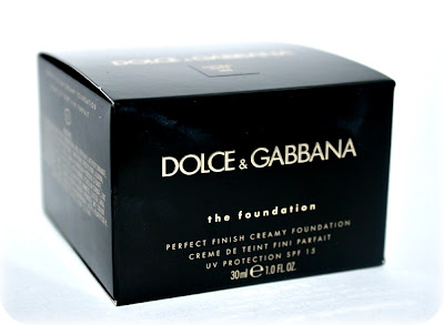
That resulted in another purchase venture for me: the Dolce & Gabbana Perfect Finish Creamy foundation. I've tried Dolce & Gabanna beauty before in the form of a delightful eyeshadow quad in Mediterannean. I still find the eyeshadows to be one of the better ones I have ever came across. So the step towards the highly raved foundation was a rather easy one. Also, the fact that ubermakeupartist Pat McGrath had a great deal in the formulation/design of this one made it a foundation-lust-have.

I ordered from Harrods during their 10% members sale weekend. Actually, I went for a clothing item I reaaallllly wanted, that, unfortunately was out of stock after purchasing it. 


Harrods know their way of Custom service, so they added a beautiful, handwritten letter.


Similar to the black and gold elements of Harrod's shop, Dolce & Gabbana sticked to their Italian Glamour roots and kept their packaging sleek and slightly opulous glamourous. It sticks to it's brand signature style and many people will recognize it.

Visible on the packaging: the ingredients

In opening the box the glamour continues (which I already smudged a bit upon...I'm not the type for full glamour, LOL).

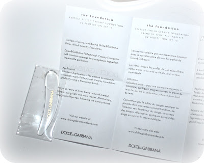
The spatula is on top of the information sheet and when taking it out it has a variety of languages:


The foundation itself is in a heavy, glass jar with a golden lid on top:


Smooth and creamy.

I was quite unsure of the colour I had to pick based on the swatches online. Moreover, not many bloggers have swatched or reviewed this one in great amount and I could only found a good review from Sabrina on thebeautynotebook. She said that the 100 natural was a bit too light for her, so I reasoned it would be good or slightly darker match (but perfect for summer skin) for me.

It is not the worst match, but I find the amount of yellow and slightly orange undertones not incredibly flattering when I first apply this. However, as with some good Asian foundations, this sometimes can dissapear and the colour will turn into a skin-match.
 Will the Dolce & Gabbana have that same effect?
Answer: Not really. It stays rather orangy on the skin. You might reason this is caused because I have picked a colour too dark, but honestly I have some other, slightly darker-toned foundations which don't go orangy on me.

I also find the colour too matte: it simply lacks a certain glow I am used to when wearing Lunasol creamy foundation or NARS sheer foundation. But that is just a personal case of preferring one formula/finish over another.

Ok, what about the formula?

I think Pat McGrath designed this with her favourite canvasses in mind: the faces of models. The foundation has a silicony feel that you can also have with the first-generation primers, such as the Smashbox Primer.
On the one hand I find it nifty to combine this into a foundation, so you would be able to skip one step into the prepping/foundation routine, which in Pat McGrath face would be really handy when working on a fast-paced tempo on fashionshows.

In real life I have to say that I have never liked the feel of the first generation primers in the first case. I can feel the silicones too much present on my face. I feel similar with this foundation. I really feel like I am wearing foundation in a not-too-pleasanty way.

Conclusion: it is not a foundation for me, period. (don't like it). I will stick to the Burberry/RBR/NARS/Lunasol. I am still happy I ordered a D&G eyeshadow palette with the order because otherwise I would have been totally dissapointed. I hope the formula of that one is still as good as when I bought my first one in Milan in 2010.

I bought it at Harrods.com who ships internationally for £34.00, but add some other good stuff because their shipping is quite expensive. Kind of makes me wonder why Harrods ships D&G but doesn't ship out Tom Ford Beauty...why?

Thursday, 19 January 2012

Things I finished...up...

Hey, I've finished up some-things !

Before doing my beautyblogger's job to add new makeup/cosmetic collections to my beauty-closet, I decided to try and finish up some things.

1. Christophe Robin Shade Variation Mask in Chic Red
Bijschrift toevoegen

Actually, I prefer the French name Rouge Vénitien that stands for Venetian Red...it sounds more sultry and Italian.

So, didn't we see this before? Yes, you have, only I reviewed the Warm Chestnut shade (here)

I have been using this one continuously for 3 a 4 weeks and it has improved the state of my hair. I used it as a conditioner and you have to see it more as a conditioner than a mask, but still good enough to make hair-improvements.

As for the colour, I thought nothing RED was going on, untill my boyfriend noticed me that my hair looked like a blondish red on top of my head. I have lighter hair there, so I kind of had a deep strawberry blonde thing going on....Wow, I always wanted to be a strawberry blonde without too much maintainance. Now I should only draw in some freckles with an eyebrow pencil and I'm good to go.

But seriously, I loved the scent and I will probably repurchase this when I finish up it's sister the Chestnut Brown.

2. Sophyto Omega Daily Moisturizer sample

I like my organic skincare for the fact that it has fewer additionals to upset a sensitive/reactive skin. I do use some more chemical based products too, but for comfort I often go for the organic varieties. And it's winter again so the skin is just more reactive.

This has been a lovely and neutral moisturizer that is more a basic than a product that would target specific aims (anti-ageing/depigmentation/etc). It is the kind of moisturizer that leaves the skin slightly mat and not with that sheen that some product have, which makes it attractive for people with oily/combination skin.

My only gripe was its scent: It smells like Omega capsules (the ones that still smell) and therefore I am still on par if I would go fullsize. I am testing some other organic skincare too at the moment, and that one is rose-scented and scentwise a bit better.

3. Själ Serum 1 liquid vitamin lift

Let's go a bit Swedish with Själ. I received this sample by choosing it myself with my last Zuneta order.

I haven't been using it long enough to say something about the results but I found the texture to be incredibly watery. In Asian skincare it would be seen as one of those water/toner products with additives against a certain skin-problem. I am not too sure about it. Still, during the time of usage it didn't irritate me and it smelled neutral.

4. Rouge Bunny Rouge Sketches on Water Tinted Moisturizer
You know you really love your sample when you treat it like your own baby and scrape the last tiny bit out of the jar: it's exactly with this tinted moisturizer.

Somewhat a smidge too light for my skintone at the moment, but so foolproof for days you want people to think you are not wearing foundation but actually are having a good skin day!

That will be a purchase in the full size, soon....

Anything you finished up lately?