Happy Valentine's Day! Today I'll feature two of valentine's fave colours, pink & gold (the
diamonds will not be present, but there is a diamond-esque sparkle
around)
Sometimes I get a slight fascination with colours that are not the most universally flattering nor the easiest to use, but still I am intrigued or beautified by them.
 |
| peachy pinks, golden pinks, pinks for lips or eyes...I'm intrigued |
Peach is one of them, pinks are the other.
You might
say: "well, these are easy to use on lips & cheeks" but there you
go: I want them on my eyes. I love the easiness of most taupe
eyeshadows, but a bit of peach or pink has the quality to make various
eyecolours a lot more interesting.
Hence, introducing:
Kate Kanebo Goldish eyes in PK-1:
 |
| Kate's minimalistic black packaging |
I have liked Kanebo Kate in the past for a couple of products that are both of good quality and reasonably priced. It's not that everything they launch is a complete hit with me. I can remember some sticky lipglosses that are not up my alley:
Their eyeshadow palettes are often a (facebookian) LIKE with me: they come with easy instructions, even if they aren't in English: the illustrations are easy to follow and most of the colours are useable and of good texture/colour.
And now I was curious if their latest release of palettes would live up to this.
 |
| "ohhh, shimmery shiny golden goodness!!" |
I really like golden hues in eyeshadows so the whole gold line looked really up my alley. As for my pick of the PK-version, well, explained above, I like 'difficult' pinks and I really liked the idea of trying out a pinkish gold, like the variety they have in golden jewellery ♥
So, let's see how that pretty palette above will look
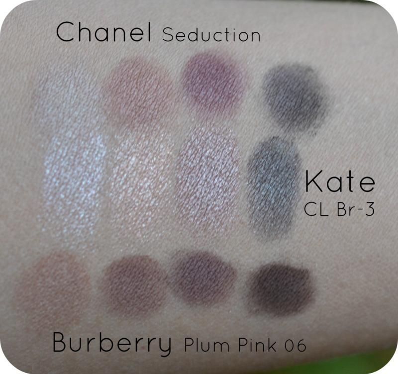
SWATCHED (no primer)
:
VISUALS:
- all colours have a metallic (often golden) idirescence, only the "white" is slightly stark
- "GOLD-yellow" lacks pigment, but is lovely for a hint of glow or layering
- "GOLD-pink" has light to medium pigmentation, also suitable for layering (see most right swatch over "brown"
- "Brown" is the most pigmented
- "Brown"is that cooler sort of brown mixed with a taupe, metallic hue, so lovely and quite
safe universally flattering again ;-)
- "Brown" has the best texture of the 4: buttery and smooth, even after 2 or 3 layers
- Palette: the 2 Golds have that "baked eyeshadow" raised idea in the palette, see picture below:

Side-angle
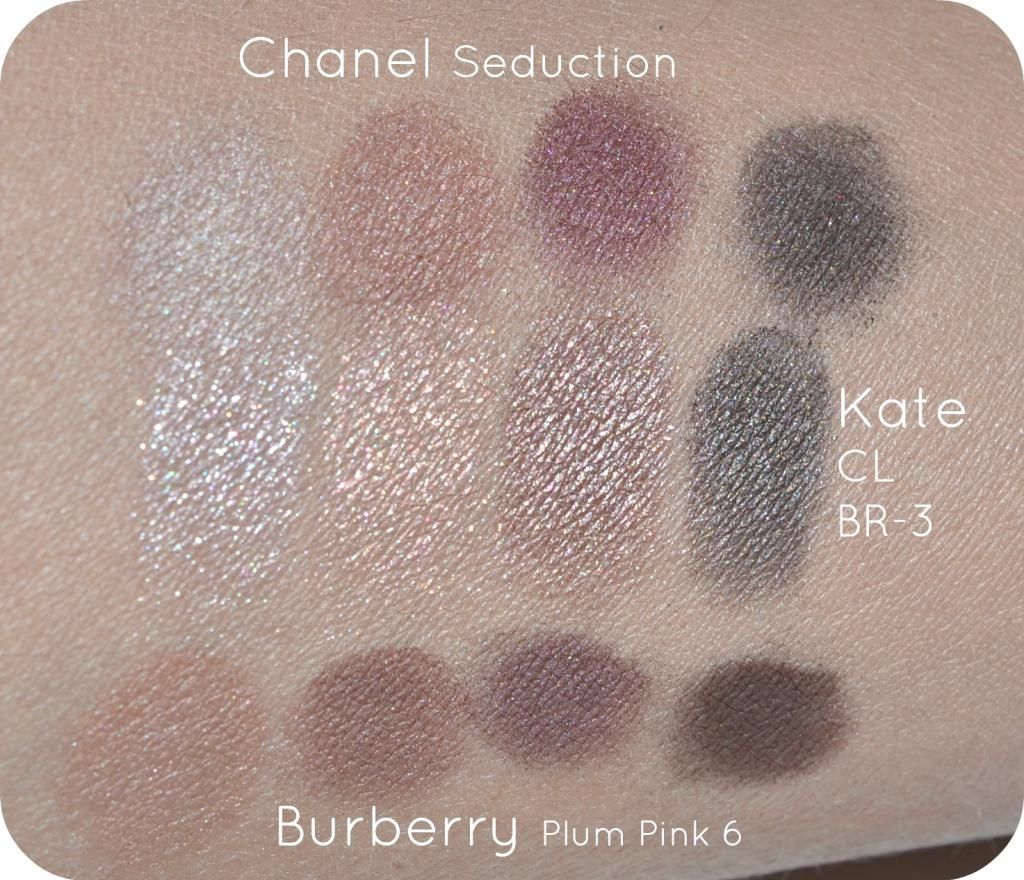
Swatches for different view upon idirescence:
VISUALS:
- "GOLD-yellow" is more of a flecked quality and applies irregularly
- "White" has a slight glow.
- "Brown"(alone) has that soft metallic glow that looks like lit-from-within
- GOLD-pink looks more like a rosy, coppery gold instead of pink.
- Layering "GOLD-pink" over "Brown" makes it more sparkly, more nightime-suitable & gives it a slight rosy edge without making that dramatic pink eye.
VERDICT:
When I first swatched this palette, I was slightly dissapointed for the lack of pigmentation of some colours. After playing with them,
layering and wearing them for a while, I found them to be fun and adding that bit of
glow on the
safer more neutral colours.
They wear quite long! I wore only the GOLD-pink without primer (they add similar colour-depth
with or
without primer, I've tried!) and they even lasted after a shower. That made the boyfriend comment why I wore eyeshadow in bed (
proving a. it's visible b. it stays on c.
clean eyes better!). The only colour I really find unhandy is the "white", but that's personal preference: it layers on as an equal white with a slight glow so other people might like it as a base for the GOLD-yellow or GOLD-pink.
The only negative is that the GOLDS are raised in the palette, making it slightly messier and spill-prone to the sides of the palette when swiping over.
 |
| eyeshadow spill-prone due to raised platform GOLDS |
CONCLUSION
I really like this palette and I have nothing in my stash that comes close to it. I didn't expect Kate to come up with the most theatrical type of pink golds which is a good thing for being office-appropriate or just liking fun, glowy makeup without going pantomine. So not all colours are evenly pigmented, however, they have a different
function
to layer or
to add a glow. Even the best rated palettes such a
DIOR have some *meh* colours/textures of the ones included in their palettes, so for a
reasonable price you get a fun and
original type of palette.
Availability:
I bought mine via ichibankao (
here) for appr.
€16.30 and they have 3 more varieties in Gold, white & blue.
PS: Speaking about DIOR, the lipgloss featured as a partner-in-crime on the pictures has been the DIOR Addict lipgloss in 157, which has a bit of pinkish-gold flecks inside as well:



.JPG)
.JPG)
.JPG)
.JPG)
.JPG)
.JPG)


.JPG)