Showing posts with label Italian brands. Show all posts

Saturday, 15 March 2014

Carroussel of Newbies...

I've been a bit quiet on the blog this week, but my wallet hasn't been...


Dutch cosmeticsstore IciParis has 40% on its lipglosses and lipsticks, and those YSL Gloss Voluptes finally arrived! -> I kept it modest with *just three* but I want Guerlain Girly so much! I also included my Net-a-Porter free shipping haul: I skipped fashion and went for beauty alone :). Plus my skin-sensitive period led me to another foundation: is it good, better, best? Read on.

So those new YSL Gloss Voluptes first: I picked *modelcolour* 49 Terriblement Fuchsia, the one Lindsay is wearing so poutily in this add:
I am slightly influenced by Japanese brands who often mention that the lipstick is the *modelcolour* or the one worn in the advertisement. I'd never would think my lips go near the poutiness of Lindsay without any filler-help, and I wouldn't want them that way unless they wear natural. I just adore fuschia: is such a popping colour without getting too sensual like red, it's fun with a dash of sensual! And so nice on making your teeth looking extra white. 
*
I also picked a safer calmer YSL Rose Satine 102 for that perfect peachy pink with that deliriously blueish microshimmer. They are extremely fruitily scented: this line...I have fierce Lancome Juicy Tube memories of the early noughties.
*
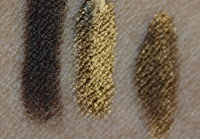
I'm still the biggest fan of their Rouge Pur Couture Vernis a Levres and I'd finally picked up Cara-modelled selection of the Rebel Nudes: this one is not so nude as it's the Violine out of Control 108.
*
The sweetest Italian drugstore SA recommended Bionike Defence Tolerance for my sensitive skin: this is the travelsize of the micellar water
*
I picked up another Charlotte Tilbury quad from net-a-porter: Uptown girl...Chants that song right now...
*
More of the Italian recommended Bionike line: it's the Defense Xage Skinergy Perfecting Concentrate: a lot of words for a serum so I hope it works as good as the title.
*
Again, a new foundation. My sensitivities spurred me on to look further. RBR has too much fragance for me right now, and mineral makeup doesn't give my pores a good cover. Kjaer Weis Foundation in Paper Thin is organic, but also difficult to work with (like quite some reviews mention). Then again, my face feels so relaxed and unirritated under this foundation and it gives the most skin-but-better finish. I just put some good work into it by blending it well with my Hakuhodo Mizubake. And some really good moisturizing before...
*
So I skipped the extraorbitant fashion of Net-a-Porter but finally satisfied my curiosity after the frequently reviewed Hourglass Ambient blush line: I picked Radiant Magenta and I think it's really brilliant. It stays on me all day, unlike some mixed reviews I read on this blush. It matches my YSL Fuschia Terriblement so well!

And some more:
 I bought the Urban Decay Naked Basics on the airplane: Some more mattes to 'date' with my Rouge Bunny Rouge Mattes.
*
The Models Inc Lip Enhancer is a GWP with a British glossy (have to check which one again)
*
And I've been reading heaps of Murakami books for the last couple of years: this is the latest one I'll dive into.

Have a gorgeous weekend :)

Tuesday, 3 December 2013

Pupa Princess Palette for eyes

*looks like teen-spirit?*

I'm slightly nostalgic for finally being drawn into a spontanious purchase of a palette based on the mere premise of pretty colours. It doesn't happen a lot these days as I meticulously investigate the whole beauty-blogosphere before I plunge in.

This created a mature and well-defined collection of Burberry eyeshadows, Rouge Bunny Rouge and the creme-de-la-creme of Le Metier de Beaute Kaleidoscopes.


 And then this cutie came along with the right set of colours and princessy atmosphere.

(also, I still like Pupa...a fab Italian brand)
Pupa Princess Palette: no flash, natural light, no sun
 No further investigation...the swatches on my arm looked really good and pigmented and for a mere €17.50 I bought in on the spot.
Pupa Princess: flash
I'll keep the suspense going on if it really was such a good decision...not in a Hitchockian way but still..

What remarked me is that Pupa's 'face' is a girl that reminds me of fashionblogger Chiara (theBlondeSalad):

 
Though, now Chiara isn't that blonde anymore, but probably still salady

Anyway, the Chiara-fication is quite prominent in Italy as she is one of their main export-products in fashion. Although Marni, Miu Miu and Prada will have a good stand in this field as well.

That brings me to the palet again...Instructions are quite clear in the brochure:

And the 1 to 8 format in their eyeshadows. (9 is an eyeliner)

Sparkly & flash closeup from 1-5 (will make better photos soon):


And 6 to eyeliner:

Swatches over RBR Time Defying Foundation in Wheatgrass:

The pigmentation of the colours are a bit of a mixed bag. I probably swatched the best ones before my impulse purchase. However, it still makes my purchase a good value.

1. One of those imo useless white (tinge of rose) shades that's oftenly in the Adult-industry sector or on girls who are a bit clueless/beginning with makeup. Ok, slightly exaggerated, but not the most convincing of highlighter eyeshadows. It is quite pigmented but I do not like the frosty/chalky quality of this.
2. A more buttery variant of 1...still a bit too chalky for my liking but it merges to a more skin-appropriate colour
3. Now we're getting to better shades (no greys intended)! A softly flecked golden peach that makes that delightful pop on the middle of the moving eyelid.
4. YES to PEACH! A slightly pinked peach that got me into this palette. The texture is buttery and it has the right satiny luminescence.
5. PEEEENK! Talking about fashionbloggers (and yes, I read them) that it will match those heap of pink coats they have been buying lately. Guilty, I  have one too but bought it before the hype. As for the texture, satiny bordering to matte.
6. "I thought it was Taupe" but it translate as a brownish Charcoal on my skin. Mmm, odd. It lacked a bit of pigmentation, however, it glides evenly over the skin so the texture is quite good.
7. Darn, look at how pretty it looks in the pan: pure mauve delight! And then it has this uneven application (3 swipes on that little spot).
8. Mmm, Chrismassy hue! A purple with multicoloured flecks with a reddish base...An even application and the flecks are not glitters but shimmery goodness.
9. Wow, an eyeliner in a palette that is actually good! This eyeliner stayed put after I washed the eyeshadows away. I love the matte-black colour, it swipes perfectly in one swipe without feathering and that is even in the 'crooky' part of my arm.


Conclusion
Not too bad for an impulse buy. It does need a good primer and not all eyeshadows have a good quality about them, but some are surprisingly nice. The plastic case is a bit cheap but for the price it's a nice addition for someone beginning in makeup or people who will always need more nuances in their eyeshadows.

Tuesday, 22 January 2013

Davines Alchemic Colour conditioner in Red

During autumn I always think I could be a gorgeous redhead but I never have the guts to take the real plunge. I have tried some colour-masks in the past, Christophe Robin Red was one of them, but they didn't make that much of a change. Enter Davines Alchemic colour conditoners: "Alchemic" sounds really promising.


The content of the jar looks like one of those Kool-Aid lemonade drinks that are widely available in the U.S, the Caribbean and Latin America too (?).

I always wonder why those drinks are so spiked with colourants whereas most Americans loved to be healthy and fit like their Hollywood starlets...then again, it's the contrast of the US and people have the right to drink their lemonade as colourful as they want.

To see how potent that is:

 Cool Aid lip stain from Paul Mitchell Academy and you can dye yarn with all Kool Aids (here)

What does this have to do with Davines? 

Oh, the colour it disposed on my hair was quite strong. That was something I really liked. On the other side, the colour was as chemically red as the what you saw in the jar.

I had Taylor Tomasi Hill- sorta red in my mind

 It didn't turn Rihanna-ish either but the colour was kinda too teenybopper for me!

It took about 4 session of shampooing to rinse the slightly cherry tone from my hair.

However, I loved how potent the colour-disposition is and might try another hue if I really want to see difference in colour.

As it is a hairmask I found the conditioning properties to be reasonable to good:

Monday, 9 July 2012

Borghese Fango Soap

I got this phrase "Cleanliness is next to Godliness" connected to old-fashioned soap, but the initial reason I bought this piece of soap was for the gift with purchase.
 It's just one of those moments the GWP draws you in (a generous set of 4 mud-masks): I already have this gorgeously frangant Portuguese Claus Porto soap, so why would I be tempted by the Italian Fango?

Well, this soap captured me for its properties and the idea of the mud/spa treatment, especially on the "absorbing action [that] helps to remove impurities and unclog pores":

The french description got overlighted, but you can read it in English and Italian
The ingredients:

A simple list with ingredients minimises the chances on senstivity issues. The Fuller's Earth is the main worker in this soap for the part that helps to draw out impurities.


When you open the package you get a beautiful green soap that already smells spa-like: slightly minty and a hint of algs or muds...
This is one of the soaps I feel best about using after exercise: It has that minty freshness and I love the idea of drawing the extra impurities out.

The packaging tells that you can use it on the face, and I do that every now and then when I feel that my skin could benefit from the Fuller's earth and other Fango-based properties. I don't think it dries out the skin on my face (or not anything more than the Nuxe 3 Micellaire mousse I described over here). I don't use it as my main makeup cleanser because for that I need a different arsenal, but if my skin is relatively clean it helps to remove sweat or some superficial dust.

I think it somewhat clears up impurities, but the best result on the face (and body) is when you combine this soap with one of their masks (that I got with the GWP)...that quite draws some yuckies out.

I bought my soap on cultbeauty over here and you can read some more sophisticated claims/properties over there too.

Thursday, 24 May 2012

Italians don't Fake: Collistar: Face Magic Drops (self-tanner)

A while ago I found myself not too satisfied with my collection of selftanners. The ones I have do a good job on my body but I found it not giving me a lasting bronze on my face...

I knew I had to find something else for the face. I tested out a product in the drugstore: Collistar Gocce Magiche Viso Concentrato autoabbronzante effeto ultra-rapido, or in easier (for me) English Face Magic Drops Self-tanning concentrate ultra-rapid effect.
Well, if you were lured to this article by the title you'll guess I do not really associate the classic Italian woman (or man) with self-tanning. I somewhat have the images of some famous Italians in mind:  Anna Della Russo (if she had work done it has been done quite naturally and she's a fan of real tanning), Monica Belluci (so beautiful at 47: if she's done surgery it was a really subtle one) who seems to embrace a more paler colour, Donnatella Versace (obvious work done & I guess real tanning),

Bellucci wearing NO MAKEUP & looking absolutely amazing  for the Elle France April 2009

Della Russo (49): her face shows signs of tanning in her life
Donatella (57): obvious Plastic surgery but the neck is a giveaway for a tanning past (probably her tan too)
(Sorry for the large pictures but as beautybloggers we look beyond the fashionable clothes of these stylish Italians and most of us are concerned with premature ageing as well. I wanted to show you the effect of tanning (Donatella & Anna) compared to frequent sun- protection (Monica B))

I DO believe the younger generation of Italians believe in a high sunscreen and will probably self-tan too, but my image of the 'classic italian' is of true sun-admirers.

So, if an Italian product would fake a tan: it should be
  1. Good and realistic looking
  2. on the darker spectrum
  3.  beautifying
And Collistar Face Magic Drops promise all 3!

Ingredients:

'Swatches'
  1. Applicator with the liquid:
2. A drop of bronze Magic on a vampire-state inner arm: 
3. Just applied: Slightly dewy and already a believable bronze glow:

4. Spot after 4 hours: a warm bronze that is neither too dark, nor too light.


My experience: 

It stood the boyfriend test! Sometimes  I apply one of my XenTan's on my face, & I get the 'what have you done??? Did you put poo on your face?' remark.  Most girls like to look beautiful and most boyfriends know the girls do stuff to make them prettier, but, like many men,  they do not really wanted to be confronted to them. Ok, there are some men who would go with you and have a dual treatment in a beauty-parlor, but somehow that wouldn't really be my cup-of-tea either.

When I apply my Collistar Magic drops I do get an instant tan (as seen in the swatches) but it's a glowy kind of tan that almost looks like good makeup or, better, a real tan!

The fading is gradual and not blotchy at all: It fades after 3 days (and I scrub & clarisonic a lot so that's why my Xen Tan isn't really holding on to my face).
Most of all, it really feels like a beauty treatment combined with tanning because my face gets a lovely glow during and afterwards.
The scent with application is a floral one with a hint of coconut, almost perfumy, but it doesn't irritate my sensitive skin at all: It smells rather like a niche perfume.
When developing there was no 'biscuit' fake-tan scent, which, close to your sniffer, is quite good.

Conclusion:

Truely, when Italians fake they sure do not let you know about it! This stuff is really a magic bronzer and really wonderful for the face.

Sunday, 22 January 2012

Dolce & Gabbana the foundation in 100 Natural Glow

Foundation is an area that I feel both happy and somewhat doubtful about. I have found some really good ones and I could be completely satisfied for what I have, and still I have days that I am not to happy about the colourmatch of my fave foundations.

That resulted in another purchase venture for me: the Dolce & Gabbana Perfect Finish Creamy foundation. I've tried Dolce & Gabanna beauty before in the form of a delightful eyeshadow quad in Mediterannean. I still find the eyeshadows to be one of the better ones I have ever came across. So the step towards the highly raved foundation was a rather easy one. Also, the fact that ubermakeupartist Pat McGrath had a great deal in the formulation/design of this one made it a foundation-lust-have.

I ordered from Harrods during their 10% members sale weekend. Actually, I went for a clothing item I reaaallllly wanted, that, unfortunately was out of stock after purchasing it. 


Harrods know their way of Custom service, so they added a beautiful, handwritten letter.


Similar to the black and gold elements of Harrod's shop, Dolce & Gabbana sticked to their Italian Glamour roots and kept their packaging sleek and slightly opulous glamourous. It sticks to it's brand signature style and many people will recognize it.

Visible on the packaging: the ingredients

In opening the box the glamour continues (which I already smudged a bit upon...I'm not the type for full glamour, LOL).

The spatula is on top of the information sheet and when taking it out it has a variety of languages:


The foundation itself is in a heavy, glass jar with a golden lid on top:


Smooth and creamy.

I was quite unsure of the colour I had to pick based on the swatches online. Moreover, not many bloggers have swatched or reviewed this one in great amount and I could only found a good review from Sabrina on thebeautynotebook. She said that the 100 natural was a bit too light for her, so I reasoned it would be good or slightly darker match (but perfect for summer skin) for me.

It is not the worst match, but I find the amount of yellow and slightly orange undertones not incredibly flattering when I first apply this. However, as with some good Asian foundations, this sometimes can dissapear and the colour will turn into a skin-match.
 Will the Dolce & Gabbana have that same effect?
Answer: Not really. It stays rather orangy on the skin. You might reason this is caused because I have picked a colour too dark, but honestly I have some other, slightly darker-toned foundations which don't go orangy on me.

I also find the colour too matte: it simply lacks a certain glow I am used to when wearing Lunasol creamy foundation or NARS sheer foundation. But that is just a personal case of preferring one formula/finish over another.

Ok, what about the formula?

I think Pat McGrath designed this with her favourite canvasses in mind: the faces of models. The foundation has a silicony feel that you can also have with the first-generation primers, such as the Smashbox Primer.
On the one hand I find it nifty to combine this into a foundation, so you would be able to skip one step into the prepping/foundation routine, which in Pat McGrath face would be really handy when working on a fast-paced tempo on fashionshows.

In real life I have to say that I have never liked the feel of the first generation primers in the first case. I can feel the silicones too much present on my face. I feel similar with this foundation. I really feel like I am wearing foundation in a not-too-pleasanty way.

Conclusion: it is not a foundation for me, period. (don't like it). I will stick to the Burberry/RBR/NARS/Lunasol. I am still happy I ordered a D&G eyeshadow palette with the order because otherwise I would have been totally dissapointed. I hope the formula of that one is still as good as when I bought my first one in Milan in 2010.

I bought it at Harrods.com who ships internationally for £34.00, but add some other good stuff because their shipping is quite expensive. Kind of makes me wonder why Harrods ships D&G but doesn't ship out Tom Ford Beauty...why?

Sunday, 26 September 2010

KIKO Double Glam eyeliner in 01

In a couple of my  posts in the summer I had been quite enthousiastic about KIKO cosmetics. This Milanese brand has been my personal discovery of this year, as I like the combination of affordable cosmetics with (often) a good quality product.

KIKO released a couple of new products for Autumn 2010 as well. It was already released in August this summer, so I was happy to pick up some items. Mind that this brand is only available in the South of Europe and some places in Germany. Unfortunately, I do not live there (yet) so my access to this brand is limited to the visits I pay and the generosity of some friends who blissfully live there.

One of their newbie things is the Double Glam eyeliner pencils. They released a selection of 6 pencils in various colour and combinations of colours.

the packaging in whimsical purple tones

KIKO double glam eyeliner in 01: ingredients

I picked up colour number 01, as it matches my scarf that you see on the background...

KIKO pencil and D&G sharpener
Just kidding, I picked up 01 as I found the brown side of the pencil to be incredibly unique.

L-R: brown pencil swatch; gold swatch; gold and black blended
It is not your standard deep brown colour. It looks like it has been mingled with a charcoal colour. That makes it perfect on days when a black eyeliner is too much drama for me, but I still want the deepness of a dark pencil to make my features stand out.

The gold is a lovely deeper gold. I find it a bit lighter than the gold eyeliner from Illamasqua 4-colour palette that I showed this week. I probably have 1 other similar colour like this, but I think the texture of both pencils is amazingly creamy. That is also visible in the swatch on the right side, as I was able to blend the charcoal brown with the gold. Result: a brown with golden undertones.

Price-wise, it can almost not be beaten. I paid approximately 6 euros for this pencil.

Overall, the pencil combines the perfect duo of colours I can use as a base (brown) and a eye-popping colour (gold). The colours are quite Autumn suitable, and the dual sided pencil format makes it perfect for bringing some eyemakeup with you without carrying around too much bulk.