Showing posts with label Kose Addiction. Show all posts

Wednesday, 26 November 2014

the Xmas set cave: Addiction Tokyo Jazz

Geehh, I've been missing this blog. It gotten almost as far that I wanted order things for the mere purpose to review it over here. Ok, eventually I ordered from narcisistic cravings but I was tempted on altruistic spending for review's sake only...

This year I'm slightly more about palettes than last year. I've already caved on Laura Mercier, a brand I seldom use...And I just couldn't resist Addiction Tokyo Jazz: Purple??? Mustard??? and my first powdery highlighter from them??? Yes, bring it on!
leather-look clutch: Addiction;  catmask: my own from Venice

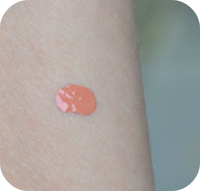
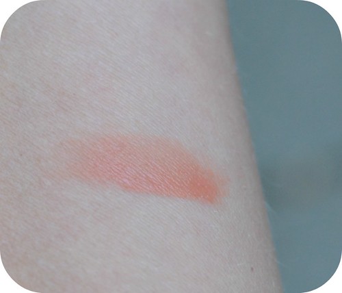
I would love to show you some swatches today, but somehow they went a bit weird on my arm. My
 instinct was like...darn, crappy quality. However, they seem to blend better on my eyelids. Though it's not as finely milled as Addiction's usual quality.


I don't want to draw any conclusions yet as I swatched the palette directly from the icy cold box it came from. The colours do look like a funky mix. 

The highlighter:

I'm not that keen on the highlighter blush: it swatches irregularly and it's quite sparkly: I'll compare it with my superbly textured Surrat highlighter soon.

And not on the pictures is their Eyeliner Pencil in Blackjack. This one knows how to draw an inky-black line: and that for a pencil:

First impression:  
I'm not too exhilarated about this set.  I'm normally quite a fan of Addiction (see earlier reviews) and I like their single eyeshadows for the combination of a buttery texture with a fun/original dimension of colours. Tokyo Jazz palette: The sparkly whitish eyeshadow is purely gritty, the mustard is as sheer as you can find and the purple is not a beautifully multi-dimensional one. Neither is the Eggplant/grey colour.
The only thing I'm really liking right now is the Eyeliner pencil in Blackjack. 

I hope my luck will get better with swatching the colours later...

Monday, 1 September 2014

Kose Addiction cheekstick in Ibiza Sunset

Before summer I said "I'm not gonna..."

I was not going to buy another bronzing product...

However, summer came and I found myself reaching for my Givenchy Croisière Bronzer frequently. Being almost perfect, and the 'almost' made me curious for Addiction again.

It was also the launch of Charlotte Tilbury beachsticks in, so 'inspired', Ibiza themed names as well. I'd either wanted to buy her 'Ibiza' beachstick, or go for Addiction again. Addiction won by price, packaging, and I already know how I love the texture and handiness of it.

And I like sunsets....

I mentioned I had been fond about Givenchy Croisière Terre Exotique Poudre Bonne Mine Bronzer #2 Douce Croisière but I couldn't remember the full name...Tah, sorry about the dodginess but the names are killing of some beauty products. As if the beauty counters will give you a test that you can only buy it if you can remember the name, ánd pronounce it correctly.

Also, it might look like comparing apples with pears, but you might see the similarities in tone above.

[Ps:  ColourMeLoud has a nifty review and comparing swatches on Croisiere, if interested]

But let's talk about the differences first. 
I frequently discussed the handiness of Kose Addiction cheekstick in my earlier reviews (here, here, here). The fact that I repurchase these pricy babies also says something. Shortly,
  •  The packaging is sturdy without compromising on minimalistic beauty
  • They make one of the better hybrid cheek/lip & sometimes eye products
  • Travel friendly 
  • Also, oily skin friendly!!! 
I experienced this during smog-city skin-oiliness. I had to abandon most blush for looking 'dirty' on my skin (aka, shifting/ looking weird on confused pores). Addiction cheekstick in Rose Damask was the only one that agreed with my skin and makeup.

But let's look at the beauty of it:
These are age-friendly multiflecks! 
 ->
All that glitters so nicely when younger might have a different effect on 'maturing' skin. Addiction made this gorgeous formula that gives dimension to skin, without actually looking Ibiza-glitterbombed.

Swatches:
No flash, evening hour:
no flash, evening hour
 Here goes difference 1: Addiction is darker in tone. It also leans more to a neutral bronze whereas Givenchy Croisiere is a hint warmer.

Evening hour: Flash
 Now the similarity:
Glow factor: both Givenchy as Addiction bring out a subtle but gorgeous glow 

However, up close:

Addiction's multiflecks give the skin a higher glow compared to Givenchy's Croisiere.

Then I'll show you how both blend after being rested on skin for 2 minutes:
outersides blended (innersides unblended for colour ref)
Addiction Ibiza Sunset will blend like a dream without any tools! This is perfect for travelling: sometimes you do your makeup in poor light and later you find yourself being too heavily 'bronzed'. A bit of finger-blending will correct this. 

Givenchy Croisiere 2 needs planning: a good brush, good light, a good base. 

Verdict:
  • Addiction Ibiza Sunset is more neutral, hence better for cool/neutral skin
  • Addiction leans darker, however it blends into a lighter colour suitable for light to fair skin.
  • Addiction is more fool-proof
  • Givenchy has a gorgeous mirror & case (ok, had to sum up a positive)
  • Glad I still bought Addiction Ibiza sunset and I should have gotten it earlier
Conclusion: 
Love, love, love this cheekstick! 

Tuesday, 24 June 2014

Es Paradis: Addiction by Ayako Cheekstick in Behind the Veil #16

A month ago I received this newbie from Addiction by Ayako (Kose):

And I've totally been lacking on my sharing and reviewing abilities. Not just because I felt lukewarm about this one (more about it later), but I've been living somewhere else with a tablet. I love my tablets when it comes to chocolate, but I seem to be incomprehensibly unmatched with computer tablets.


Back to my typetypetypetype laptop, my fingers are getting the workout again. 

I was really anticipating the launch of Addiction by Ayako Cheeksticks for their Summer '14 Es Paradis line. 
This is not the official promotion photo, but I love to show it from an angle as you can see the cheekbones, a better colour disposition of the eyeshadows with her eyes, and the cheekstick doing it's magic.
From the promo video, fingertapping is not just for laptops, for cheeks too

I basically picked the only colour not featured on the model: 

'More' looked too much like a terracotta orange that wouldn't match my cool undertones. 'Ibiza Sunset' like yet another bronzer shade. I was interested in Behind the Veil, a peachy shimmery type of colour.

At first sight, it does look like 'everything's peachy':

Unlike the previous cheeksticks, this one has flecks/shimmer inside.

Let's compare it to Rose Bar:

My first thought was: NARS multiple in Orgasm. I was intending to steal borrow a tiny chunk from the Sephora shop, but morality kicked in so you just have to take my word for it: they are almost dupes.

Swatches:

So before you will give me the "what's the deal-it's so pretty?" do have to agree upon that; it's pretty and shimmery and that NARS Orgasm kinda glow that is the most cultish colour ever.  

Then again...

Rosebar definitely looks more opaque than Behind the Veil. 

Also, it's a matter of personal taste. I've lived in a warmer, smog-infested city for a while which turned my skin into neo-teenage oiliness. Anything glimmerish that enhanced my pores has been a total no-go for that time being. So timing was a bit off with this cheekstick. 

I've also never been a fan of NARS Orgasm for similar reasons. I take my glitter quite sparingly and even though think one is subdued, it's still present when your pores do not resemble total tiny flawlessness.

Back to Holland, I have to try it again! The climate is starting to turn my skin into a slightly dryer and less oilier surface so I am quite sure it can work a bit better for me.

It looks gorgeous on lips too. Delightful velvety glow and the texture of the Addiction cheeksticks cannot be beaten for hybrid application (eyes too).

Conclusion: a sweet, sheer hybrid but take care if you are glimmer-shy

Friday, 7 March 2014

Kose Addiction Eivissa Dream eyeshadow in 075 Private Beach

Blossoming flowers, and some might already be thinking about sand between their toes for the upcoming summer.

Talking about sandy beaches...doesn't this one above look like it???

So yeh, Kose Addiction by Ayako has already been fully immersed into the summer theme of the Party Island pur sang: Ibiza, or Eivissa in its own language. It seems like they'll keep this theme for Summer '14 as well with the Es Paradis line (source: rougedeluxe): There will be cheeksticks again, but for now let's focus on the spring-range.
I already ventured upon eyeshadow "Meeting at Dome" [here] which turned out to be a pleasantly fun surprise. 
I like the name: I normally would steer away from meeting people at dawn: It's actually one of the most beautiful times of the day but my waking-up face needs mucho serum  to see the light of day. Unless I've been up all night: sometimes I wonder why they call it beautysleep as staying up could keep you kinda pretty [or were the others more intoxicated to see you as pretty? Ehm, long time ago].

Did you guys know that San Diego has a beach that is made up from tiny mica particles:
source: here
As for the eyeshadow colour [disgressing who?]: 'Meeting at Dome' was cooler than expected, and my craving for something warm and mushroomy/taupy lead me to Private Beach.
I'll show the box for the ones unfamiliar with Addiction by Ayako. Ayako the makeupartist used to work for NARS: the sleekness of the package and lettering is something she brought to her own brand.

The colour is indeed a taupy mushroom. It sounds boring but then I'll show the my first swatch from a sideway angle:

My booboo is to start comparing at first sight, but that will keep the focus on the texture. So it's indeed a sandy beach texture with a gorgeous sparkle on top. I've compared it with the Charlotte Tilbury Golden Goddess shade no 2: Enhance to show how it differs.

Then again, the type of sparkle reminds me of Charlotte Tilbury's 3rd type of eyeshadow: the Pop-colour. So let's bring that one in even if the colours do not compare at all:

Swatches:

In theory, the glow-factor is similar to Charlotte Tilbury's POP shade, but I think Addiction has a tad more sparkle that somewhat layers differently. I'm slightly out of my cosmetic vernacular of to define it as sparkle overlayer or shimmer...Mmmm, but it is different, though.

So after all this elaborate textural comparing...Let me define the colour: It is indeed a warmer colour and it seems to be one of those generically available mushroomy colours out there. But as shown (too much? Never too much for a beauty blog), it's far from standard. The cooler shimmer/sparkle/shimbarkle actually makes the eyeshadow appear beachy...like the water still present on the sand at the shore.

It's an interesting colour on its own. The colour scheme of neutralness, warm and cool makes it wonderful for mixing with other palettes. Charlotte Tilbury already likes a party in her palettes (disco makeup-tips? Woot!) so it's perfectly mixable with Addiction Eivissa! And not just on the side: Addiction Private Beach makes a gorgeous shade for layering. I've been layering it over my matte Rouge Bunny Rouge Blackpepper Jay: that shady wallflower goes from working horse to total attention queen. Ok, a visibly glowy shade.

Longevity
As usual from Addiction's genius creations: without primer for about 6 hrs before fading. With a primer: depends on the primer but long after the next dawn.

Price
Yes, it's not the cheapest one for about €21 but I think it's not too ridiculously expensive either compared to the likes of Dior or Chanel.

Conclusion:
A hot neutral that can party around with a variety of others or make a daytime makeup more fun.

Thursday, 6 February 2014

Addiction by Ayako - Eyeshadow in Meeting at Dome 071 (Eivissa Dreams '14)

Last week I had Kose Addiction Spring 2014 Eivissa Dreams
 on my radar.
It didn't took long for me to order my first eyeshadow from this collection: Meeting at Dome 071.

I opened the lid full of expectations of receiving a warmish taupe ~Something like in the promotion photo:

Reality has been slightly different. I will show you numerous photos of different angles and light-positions so show you the complexity of this eyeshadow.
Opening it for the first time: It looks like a mix of platinum and silver or more of a cool colour than a creamy taupe.

Direct sunlight ~ a cooler silver:

Slightly shaded/partly in sunlight ~greyed and speck-ly:

Same as above, only close up (see the turquoise sparkles!)

Another direct sunlight shows a slightly creamier/aspect of the silver:

Swatching it brings out a silver with a hint of mauve:

Same above, only close up:

Another swatch photo in a mixture of shade & light outside:

Verdict:
I think it is easy to conclude that this colour is far from a warmer colour as in the promotion photo. That doesn't make it a dud: au contraire! I love the complexity of this platinum that lights up in subtle turquoise, silver and lavender/mauve or a slightly smoky dept in various lights and shadows. I tried to compare it with my existing eyeshadows and thought about NARS Lhasa, but that one wasn't even close. 

I think it will make an awesome Ibiza colour as it works brilliantly in warm sunlight, and gets the smokey dept during the evening.

As for the quality and longevity: I adore Addiction by Kose's eyeshadows on this part and this one is just as brilliant: buttery smooth and the specks/glimmer is suitable for young and slightly older.  It holds for 8 hours with foundation underneath (like my swatch photos) and I have to try it with Edward Bess eyeprimer to see if it holds even longer.

Conclusion:
I'd almost book a flight to Ibiza to show off this eyeshadow.

Thursday, 30 January 2014

On my Radar...

Kose by Addiction Spring 14 Eivissa Dream...

In contrast to the innocence of Jill Stuart Beauty, Addiction by Kose choses a hedonistic theme: Ibiza. I'm slightly dissapointed that there are only powder blushes around, not anything stick or *gasp*...the liquid. But I like look no. 1 "Dizzy Love".

If you go to Kose Addiction site you will launch into a drum-infused video of a bleachy-blonde model being made up (she's famous but I have no clue who she is...any readers?).
In a way, not that Ibiza-promotive: the repetitive application of either lipgloss or lipstick, but look 1 is a fresh, beachy neutral that I like, especially the eyes. Look no 2 is a bit too muddy IMO.

The eyeshadows might be a bit too tame or neutral to some but I really like Kose Addiction's quality. Also, these colours seem to look stellar on greenish eyes and will be glowy and radiant on various eyecolours

I think I will go for "Meeting at Dome" (=meet me at Dawn?) first: a delightful & glowy taupe.

Thursday, 2 January 2014

BBB's Best of 2013 - Makeup

Welcome to BirkinBagBeauty's Best of 2013!

I'll be starting off with all pretty and functional 'paint': the warpaint, peacepaint, coverpaint, enhance-paint and the funpaint of makeup.

"eyes are the mirror of the soul" (and a dent in my wallet)
I have been rekindled in my love for makeup in 2013 and the eyes were the focus. I was one of the 1st to get Le Metier de Metier Bauhaus (see here) and I still love the boldness & versality of the palette.
*
 I refound an older love too: Coffret d'Or Shine Accent Eyes in 01 Orange Spring I bought here.

It is like a more subtle version of my latest Charlotte Tilbury palette in Golden Goddess, and has peeeeeaaach in it.

“Lips are the fingerprints of love.” 
~Tyler Shields
Lipstick:
Givenchy Le Rouge in Rose Boudoir is the one I reach for the most: often after experimenting with newer colours/textures in the shops. It is velvety without being too matte; it doesn't compete with a strong eyeshadow, but isn't too boringly neutral either. Overal, a nice pop of flush for the lips in that sublime Givenchy texture.
*
Lipgloss:
I loved YSL Rouge Pur Couture before most-famous-face-of-'13 Cara became face of that brand too: actually seeing a tomboy-type glam up with the right lipgloss is a good salepoint for me. I really like how the lipgloss glows without going into tacky territory; how it last long enough without feeling obtrusive; and the way it fades into a pretty stain. As for the colour: This reddish pink is vibrantly present when I want to have a stronger definition on the lips and a softer focus on the eyes.

“As beautiful as woman's blush, as evanescent too.”   
 ~Letitia Landon
This has been a difficult vote, as my infatuations in blush is as evanescent as described in the quote above. Good thing I could nominate the different textures...

Blush/Bronzer hybrid Michael Kors Bronzer Powder in Flush 02 has already gotten my stamp of approval in December (here) and it has gotten the top vote for this category. Runner up is Rouge Bunny Rouge at Goldcombe Bay for a contouring bronzer hue without blushtones.
*
For days that I love to have everything organic, I vote for Josie Maran Cosmetics Color Stick in Petal Pink: it is slightly shimmery and in a rosy hue. It blends quite nice and the scent is delightful.
*
I haven't forgotten about my early 2013 blush-infatuation Kose Addiction Cheek Polish in Tadzio 06 (review here). It is a fresh & cooler pink that lightens up the face and I love it when all other features (lips/eyes) take a step back.

Yes, and a special mention for cheek/lip multitasker 
 
Rouge Bunny Rouge Decadent Duo in Rumba Cubana:
This one has been my purse-favourite. The blush-side is always the right colour with a multitude of lipcolours and wonderful for the mid-day perking up. The lipgloss has the quality to plump lips without too much drama, and feels like a dream. The above Rumba/Cubana is as good as empty and I have a backup for future uses ♥ 

"The best thing is to look natural, but it takes makeup to look natural"
~Calvin Klein
Full Cover: Rouge Bunny Rouge Time Defying Foundation in Wheatgrass
I'm a complicated person about my base foundation: I'm often too sensitive for the likes of Chanel or YSL (hello fragance), I have to cope with winter-patches and I want to look younger. Enter RBR latest foundation: scentless, with plenty of goody ingredients and I get "your skin looks good"-compliments when wearing it. My only pet-peeve is the colour: it looks dark in the swatch but applies quite light: But it's a good match when not on selftan.
*
Light Cover: Koh Ren Do Maifanshi in 123
Revieved here: a perfect colour and dewy complexion. Now if it only was sold at more places than Barneys.

“Statistics are like a bikini. What they reveal is suggestive, but what they conceal is vital.”   
~Aaron Levenstein  
yes, that's the Game of Thrones actress (the one with the white wig)
So we're not talking bikini's yet, the ones in Australia and Brazil probably are, but a good concealer should be as invisible as it wizardy strengths to what it has to conceal. So the same story about my skin, [problematic], and I get the occasional pimple between what we  the lovingly can call 'living lines'.

Eyes:
Givenchy Mr. Light in Mr. Toast 03  is as buttery as you need for under your eyes. It diffuses dark circles in a wonderful way without getting topsy-turvy panda look. It photographes nicely too, without flashback. It doesn't settle in the lines and it is wonderful for shadows around the nose, and that bit of extra light to optically plump lips.
*
Organic:
I discovered NVEY Eco Foundation thanks to blogger Emma. I love organic products on days when I want to detox from the non-organic stuff I put on my face. It is somewhat similar as RMS uncover, only without the heavy/pasty feeling RMS has. Peach 875 is actually a bit too light for me, but it works wonderfully on red/flaky patches as the creamy consistency smoothes without irritating.
*
Pimples & Eyes
NARS Radiant Creamy Concealer in Vanilla is my multitasker for eyes/pimples. I think you've encountered several raves and I can only say that I love it as well.

That is my Best of '13...Makeup-list for now: I could extend by listing the pencils etc, but I wanted to focus on the ones that really stood out for me in 2013, not the whatever rotation ones.

So, what have been your faves and why?

Sunday, 22 September 2013

Kose Addiction Cheekpolish in Chic 01

Last time I announced I was "in love" with my latest Addiction Cheekpolish in Tadzio.

My infatuation led me into more promiscuity in the field of the cheek spectrum: In normal English "I liked it so much that I went for another colour"

I already announced my curiosity for Chic, a colour that I thought would be shader-like from the online swatch-chart of Kose Addiction ( 1st left):

You can understand my surprise was rather big when I saw it resembled something livery-orange.
chicswatch
 I had already seen the swatches from beautyblogger-maven DrivelaboutFrivol and her swatch of Fresh kinda scared me: no offence towards the perfect complexion & makeup-skilledness of ms. Drivol herself, but to me orange is something that reminds (most Dutch) of soccer matches and festivals.  I thought Chic would be really brownish compared to Fresh, and it a way it is, but still quite orangy imo.

However, blushes are often not what they appear to be: some look terribly boring and make a complexion speak a thousand cheekbones, and others are so fun and perky in the pan and look like carnival on me.
chicswat
Addiction Chic: semi-blended, not completely
I had to think deep for a similar colour in my collection. I reached for Julie Hewett Natural:

Which was absolutely not a match at all. Anyhow, it does show how a dark shader-colour can look too unnatural when the skin gets paler:

(comparing swatch on 'tan' side of arm -NW 30)
When going pale in winter it is often difficult to find a good shader colour: most bronzers/shaders will become too stark and contrasting and I actually like a mixture of peach for more freshness.

Verdict:
  • looks unappealingly liver but becomes soft peachy shader-colour on N15-25 skin
  • formula is soft, velvet and without any hindering sparkles
  • longlasting
  • perfectly blendable, even for the clumsy & untooled
  • mid-price range (Chanel) but more product
  • perfect for under the cheekbones to define
  • Mixing Tadzio & Chic makes a wonderful muted rose!
Conclusion:
It was love at first sight with Tadzio and Chic is more of a "friends first, longtime connection later". However, these type of relationships have more durability than the average crush and I have been reaching more for Chic lately than Tadzio. Chic really is a wonderful way to define the cheekbones without going too stark & shaderlike.