Showing posts with label cream blush. Show all posts

Tuesday, 24 February 2015

Pots & a Pan

Spring is in the air, so what's cooking?


 Let me show you my new pots. And my domestic virtue is still slightly underscored by my love for makeup, but I still have a cute pan thrown in it as well. I mean, beauty and health also comes from the inside, right?

  •  Top: Gressa blush/lipstick Radiant: I've gotten on the organic Gressa bandwagen and got both this blush/lipstick as the foundation.
  • Right: RMS Illusive blush: I'm trying to get as organic as possible lately and I did not have a colour like this yet in the organic range.
  • Bottom: NARS eye Paint in Ubangi: I know, not organic but still pretty & pot-like to feature.
  • Left: Tata Harper Volumizing lip & Cheek tint in Very Sweet: Oh my, this is the perfect organic hybrid between liptint and cheektint. It has a highlighting quality without compromising on colour.
  • Left Top: RMS lipgloss in Bloom: a GPW from cultbeauty and a sister of Tata Harper very sweet. This one is a true lipgloss instead of a hybrid.
  • Middle: Stella-Marie-Maris Pure Shea Butter: I got this one for my flare-up skin as it is the most neutral of butters. It takes some work to get it working for you, though.

As for swatches [unblended], I'll spare you the NARS as it has been featured a-plenty. Let's go for my latest organic ones:
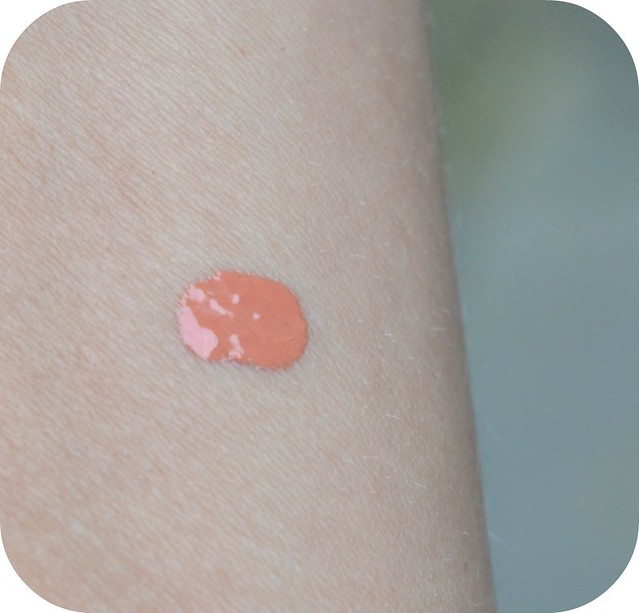
  1. Gressa Radiant is one of the most pigmented and poppiest colours in my organic section. It is almost too pigmented for my liking. On young-n-pretty skins it would look like this (See Brittany). I'm slightly hindered by some earthy note of fragance: it's not my favourite scent.
  2. RMS Illusive: I needed a perfect Mauve-nudish blush in my collection and RMS Illusive seemed to be qualified. I think it's slightly muddier in real life. I was hoping for the cream version of Surratt La Vie en Rose. It still translates as a neutral-slightly cooler blush on my skin but I think the formula is sorta hard during colder weather.
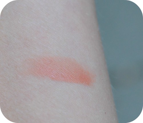
  3. RMS Bloom: I've been most delighted by this GWP. It's a true lipgloss compared with Tata Harper's clingier formula, but you could still use it as a short-term cheekgloss.
  4. Tata Harper Lip & Cheek Volumizer in Very Sweet: Tata Harper makes brilliant organic products and seeing her doing makeup makes my heart sing for joy. I think this balm bring out a volumizing quality on cheeks (& lips) without feeling heavy. Very Sweet has been a gorgeous peachy highlighter-esque colour and I hope she'll make more of them. Hint: in dusky rose?
I have not added any blended swatches yet. I will do and compare them later: for this post I just wanted to show you the difference in texture.

I've said this a couple of times, but *organic* is not some kind of magic word. As for my latest pots, there is a new love that could replace anything chemical [Tata Harper] and there is the one that probably is more difficult than I'd expected from the raves [Gressa]. In any case, beauty reviews are highly subjective and based on so many things: weather, hormones, age, fragance memory and I could go on.

Basically, just my 2 cents or that bit of herb in the cooking...

Monday, 13 October 2014

Becca Beachtint Raspberry/Opal in Vine

Sometimes moving images say more than the still ones.

So I would like to Vine-review Becca Beachtint in Raspberry/Opal I gotten in July (here). It started out as a cushiony dream but I have some reserves I will share later. Let's Vine first:

<

 Pros
  • love the colour-payoff: cannot get enough ofa  berry-ish glowy cheek
  • blends easily on my skin 
  • Fits my Adesign Pointed Foundation brush like a dream
Cons:
  • dents easily: I've only used it about 10 times to get this dent!
  • Not really fingerproof: this one needs a proper brush for applying

I'm slightly dissapointed to have this effect when I only had it for 3 months. The result is pretty but the Cons make it a blush I do not reach easily for it. Also, It looks I only have 50% left after only 10 uses, which makes it quite pricy per use.
unlike the bird, the early pan doesn't get the worm

I really love Becca as a brand. I prefer their matte eyeshadows over Rouge Bunny Rouge's, I love their illuminators and they have some awesome blushers. This formula is neither fish nor fowl.
It also dissapears faster than my other blushes.

Conclusion: Love at first sight can be deceptive if the substance looked more than it eventually is

Tuesday, 24 June 2014

Es Paradis: Addiction by Ayako Cheekstick in Behind the Veil #16

A month ago I received this newbie from Addiction by Ayako (Kose):

And I've totally been lacking on my sharing and reviewing abilities. Not just because I felt lukewarm about this one (more about it later), but I've been living somewhere else with a tablet. I love my tablets when it comes to chocolate, but I seem to be incomprehensibly unmatched with computer tablets.


Back to my typetypetypetype laptop, my fingers are getting the workout again. 

I was really anticipating the launch of Addiction by Ayako Cheeksticks for their Summer '14 Es Paradis line. 
This is not the official promotion photo, but I love to show it from an angle as you can see the cheekbones, a better colour disposition of the eyeshadows with her eyes, and the cheekstick doing it's magic.
From the promo video, fingertapping is not just for laptops, for cheeks too

I basically picked the only colour not featured on the model: 

'More' looked too much like a terracotta orange that wouldn't match my cool undertones. 'Ibiza Sunset' like yet another bronzer shade. I was interested in Behind the Veil, a peachy shimmery type of colour.

At first sight, it does look like 'everything's peachy':

Unlike the previous cheeksticks, this one has flecks/shimmer inside.

Let's compare it to Rose Bar:

My first thought was: NARS multiple in Orgasm. I was intending to steal borrow a tiny chunk from the Sephora shop, but morality kicked in so you just have to take my word for it: they are almost dupes.

Swatches:

So before you will give me the "what's the deal-it's so pretty?" do have to agree upon that; it's pretty and shimmery and that NARS Orgasm kinda glow that is the most cultish colour ever.  

Then again...

Rosebar definitely looks more opaque than Behind the Veil. 

Also, it's a matter of personal taste. I've lived in a warmer, smog-infested city for a while which turned my skin into neo-teenage oiliness. Anything glimmerish that enhanced my pores has been a total no-go for that time being. So timing was a bit off with this cheekstick. 

I've also never been a fan of NARS Orgasm for similar reasons. I take my glitter quite sparingly and even though think one is subdued, it's still present when your pores do not resemble total tiny flawlessness.

Back to Holland, I have to try it again! The climate is starting to turn my skin into a slightly dryer and less oilier surface so I am quite sure it can work a bit better for me.

It looks gorgeous on lips too. Delightful velvety glow and the texture of the Addiction cheeksticks cannot be beaten for hybrid application (eyes too).

Conclusion: a sweet, sheer hybrid but take care if you are glimmer-shy

Sunday, 22 September 2013

Kose Addiction Cheekpolish in Chic 01

Last time I announced I was "in love" with my latest Addiction Cheekpolish in Tadzio.

My infatuation led me into more promiscuity in the field of the cheek spectrum: In normal English "I liked it so much that I went for another colour"

I already announced my curiosity for Chic, a colour that I thought would be shader-like from the online swatch-chart of Kose Addiction ( 1st left):

You can understand my surprise was rather big when I saw it resembled something livery-orange.
chicswatch
 I had already seen the swatches from beautyblogger-maven DrivelaboutFrivol and her swatch of Fresh kinda scared me: no offence towards the perfect complexion & makeup-skilledness of ms. Drivol herself, but to me orange is something that reminds (most Dutch) of soccer matches and festivals.  I thought Chic would be really brownish compared to Fresh, and it a way it is, but still quite orangy imo.

However, blushes are often not what they appear to be: some look terribly boring and make a complexion speak a thousand cheekbones, and others are so fun and perky in the pan and look like carnival on me.
chicswat
Addiction Chic: semi-blended, not completely
I had to think deep for a similar colour in my collection. I reached for Julie Hewett Natural:

Which was absolutely not a match at all. Anyhow, it does show how a dark shader-colour can look too unnatural when the skin gets paler:

(comparing swatch on 'tan' side of arm -NW 30)
When going pale in winter it is often difficult to find a good shader colour: most bronzers/shaders will become too stark and contrasting and I actually like a mixture of peach for more freshness.

Verdict:
  • looks unappealingly liver but becomes soft peachy shader-colour on N15-25 skin
  • formula is soft, velvet and without any hindering sparkles
  • longlasting
  • perfectly blendable, even for the clumsy & untooled
  • mid-price range (Chanel) but more product
  • perfect for under the cheekbones to define
  • Mixing Tadzio & Chic makes a wonderful muted rose!
Conclusion:
It was love at first sight with Tadzio and Chic is more of a "friends first, longtime connection later". However, these type of relationships have more durability than the average crush and I have been reaching more for Chic lately than Tadzio. Chic really is a wonderful way to define the cheekbones without going too stark & shaderlike.

Saturday, 7 September 2013

Kose Addiction Cheek Polish in Tadzio 06

Kose Addiction +  new cheek product + new colours = obsession
That is the simple math for today. I had to buy this new cheek Polish and the only debate was:
1. would I stick to one colour?
2. what colour(s)

I decided to keep it on the modest side and picked one, in a colour that looked like a muted rosy pink online: Tadzio 06

Though I was enticed by the shader-like colour of Chic or the softer pink hue of Swingin':

The idea was that I loved the colour-scheme on the Autumn '13 model/face, who, besides being stunning, wears the type of colours I really crave.

Did you know she can blink really sweet for it in the animated video (besides of the standard 'turned-on'-gaze)
always good marketing: 'extase' face on a pretty model
Anyway, the descriptions are not something I can deciper yet. Perhaps I will go on a Japanese course one day. I'd love to visit Tokyo, for sure:

However, 12 ml is a generous amount of product. Indeed, the bottle reminds me of a Rescue Beauty Nailpolish tube:

And if you'd show this to your hapless boyfriend (male friend/brother): he wouldn't think it was a blush either. Totally nailpolish brush:

Swatch [with flash]
 
 Initially, I thought the idea of the muted Rosy Pink was more of a bright Rosy pink.

Swatch, unblended (natural daylight):
 

Swatch: slightly unblended, flash:
The colour is indeed brighter than I anticipated for. On the other hand, it is a colour that I do not have yet and bridges the gap between a poppy pink and a muted rose. Also, the wonderful way to perk up morning (maturing) skin.

Close Up:
So I mentured 'maturing skin' (oh, how we love these euphinism for 'older', right?). The close up shows how wonderfully it blends over imperfect skin. I am absolutely no blending pro and this blending has not been done with sophisticated brushes, just hands.

Verdict:
  • Novelty: wonderful new colours
  • Packaging: matte glass bottle is gorgeous, just a bit unhandy
  • Hygiene: I'd suggest putting it from the brush to a clean spatula to keep it hygienic
  • Pigment-value: incredibly pigmented. Personally, I had to tone it down with a tad of highlighter but excellent for the people who like visible colour
  • Blendablity: really good. Even for the fast or unprecise.
  • Colour: perfect prep-up for tired skin with a neutral/cooler undertone. Also, for people not really liking poppy pinks but still like a dash of freshness.
  • Uniqueness: I'm a blush-o-holic but I haven't thought of a good dupe yet, colour-wise. As for the formula, there are similar products but not that many.
  • Price: mid-to-expensive. About similar price as those new Chanel Le Blush Crèmes, only more value (more product), more original colours & better pigmentation.
CONCLUSION:
I have to be dodgy to say "I'm in love". And if I wasn't, the blush I am wearing could have fooled you. 

Sunday, 16 June 2013

Using, Used, Gonna Use...

Summer is almost here and I begin to enjoy colours again.

 So the products of the "used, using...gonna use" is finally more than just skincare:
Using:
 *Givenchy Le Rouge lipstick in Rouge Boudoir 204*
 This lipstick is bright and happy enough to pair up with a bit of (fake) tan and not too extreme for the lipstick-shy like I am. The moisture factor is not as dewy as Chanel but I actually like its resistance better for warmer weather.

Used:
*Omorovicza Queen of Hungary Mist sample I got in this set*
 It feels refreshing on the skin, but I was dissapointed in the misting effect: it's a pump instead of an aerosol mister. A pump might be friendlier for the environment but I prefer a thinner, aerosol-based spray instead of the slightly bigger drops you get from a pump. Also, for its price I consider it not that much better than earlier mists I tried.

*By Terry Rose de Rose Sheer Liquid blush in 03 Amber Rose*
 It is not fully finished but I have it since 2010 so I think it's due. As you can see, it is a blush lovingly used: it really needs a tiny drop for a gorgeous flush and I used lots of drops...I would absolutely repurchase but it's not for sale in Holland anymore.

Gonna Use:
* Kiko Colour Block in 04 Fierce Violet*
 Yes, I got into a Kiko shop again and fell in love with the vividness of Fierce Violet. First, It was hand-testing...then I decided to test it on my eyes, went into really warm weather, and after 9 hours it still was budgeproof and vivid!
Normally I sheer away from reallllly brights for my eyes but I totally love this sort of purple.

Wednesday, 15 May 2013

Hakuhodo Mizubake

After my introduction in Hakuhodo brushes I went for a speciality brush aimed for cream formulas: the Mizubake:
It was not my only item:
I also picked a cheaper facebrush for on-the go: the K022
I like the K022 enough but I am baffled by the performance of the Mizubake.
 Let alone that it looks so incredibly beautiful and expertised as a tool for the face.

First I went 'skinny-dipping' into the products I bought it for: My cream formulas of foundation & cream blush.

I did a a *Cinderella Moment* to see if the brush fits: 
it was slightly too large for the RMS and the Julie Hewett cheeky, 
however,
the shoe brush fitted perfectly for my Lotree cream blush:
Mizubake dippin'  in
So I swatched that one...

The colour deposit afterwards:
I don't know which reviewer(s) it was, but I agree with her that it looks so satisfying when having a white brush: you can see perfectly how the formula is distributed on the brush: really equal:
same Mizubake & Lotree, only taken with flash
And that is how it translates on the skin:
 
[I used soft, swirling motions and *deliberately* didn't blend out to the sides so you can see the position I placed the brush]

Actually, since I have this brush I started to rediscover my *slightly* neglected older cream blush formulas like the Lotree one above. I have been loving peachy blushes lately so this colour above fits the bill.

Also, it works like a dream with the RMS concealer/foundation: it's spreads out so much thinner than if I would do it with my hands or another brush.

Conclusion:
  • Incredibly beautiful brush with that hint of 'Orientalism'
  • excellent for cream formulas
  • equal colour disposition of cream formulas 
  • perfect for thicker formulas of (cream) foundations, especially when spritzing the brush beforehand with a toner/filtered water/etc
  • pleasure to feel it swirling on the skin 
  • rediscovered my beautiful 'wallflower' blush thanks to it
A more expertise review and what got me going for this one is on LolasSecretBeautyBlog and TheNonBlonde has been pretty convincing as well. GlossedIntoTranslation loves it so much it even became her header...can you figure?  

It's available from Hakuhodo over here.

Saturday, 30 March 2013

Pretty Springy Things

- Something Cheeky
(YSL Creme de Blush 9)

-Something (from) Lush 
[Mumkin]

- Something Glossy 
[Le Metier de Beaute Sheer Brilliance Cannes]
Cannes looks really sparkly in spring-sunlight, but it's quite subtle on lips: 

- Something Mask-y 
Etos (Dutch Brand)
I guess it's more of a no [stop] buy for me lately....

Friday, 14 December 2012

Review: Kose Addiction Cheekstick 14 Damask Rose

-I've bought a new Kose Addiction cheekstick- 
-I like it -
 -here are the swatches- 

Ok, you know my reviews will not be that easy but I will be short(er) about it.

I saw the announcement of the range of new colours by Iris on Rougedeluxe: she's often the first in English with the scoops on the newest releases.

And so I also found out that Ayuko, the makeupartist of Addiction, is a woman!


I often like Ayuko's choice of models: they have unique faces that are perfect veils for her makeup-range, without going into the faces of the models I consider used too much (sorry Kate Moss). I totally love the angle of the photo and how the mustard eyeshadow stands out: it almost made me buy that shade, and I still might.

I wrote to Iris that Damask Rose looked like a muted Amazing from the earlier line. I have been right about this: (see below)
I don't have Amazing myself, but I will link to Kate from DrivelaboutFrivol's picture to give you an superclear swatch of it (here)

My swatch of Damask Pink (3 swipes layered!):

COLOUR:
First, there is a difference between Kate's albaster skin with a hint of warm/yellow and my light/medium skin that hints towards cool. I believe that Amazing would appear cooler on my skin than hers.
I consider Damask Rose a true pink that hints towards fuschia. It is not really bubblegum pink, but it has a bit of a cooler tone in it that tinges blue.

COVERAGE:
On cheeks: I have discussed this with Kate and noticed myself that the earliest 'batch' of Kose Addiction seem to have a different consistency, almost better and with a higher coverage. First, I thought that my last cheekstick Rose Bar (review here) was merely too muted to show up vividly. However, I think that, compared to my 1st cheekstick in Revenge, that the coverage is not as strong.
I still like, better say love, the cheekstick and it's coverage. I layered 3 swipes of stick over each other and it doesn't get blotchy. This is personal, btw, because when you like your blush strong and vivid you might think "need more". I like a blush that looks like it comes from within. This looks like a from-the-ski-slopes-colour.
On Lips: I have raved about Addiction cheeksticks before for being a fantastic hybrid product. I still love how velvety and non-drying it feels. However, the consistency changed and so does the cover on my slightly rosy-toned lips. So here is where my vivid territory comes in and I need a couple of layers to make the pink appear. That is different with the coral/pink hue of Revenge: that one gave me that fashionable pout-n-shout-vividness that was happening early 2012. With Damask Rose it's sheerer, now.

CONCLUSION:
I love this colour in my collection, especially in a cheekstick. It travels handily and it's consistency makes blending and layering easy for me when I don't feel like blending all morning. Only, it's not a realy hybrid colour to me, so I will keep it for my cheeks only. Or tint my lips on the road if I really have no other lipsticks around. And that sounds close to impossible, as the 5 lipsticks are always sollicitating for my attention in my bag ;-)
The price? Yeh, it's Kose Addiction: check for the price & product here.