Showing posts with label Catrice. Show all posts

Saturday, 26 October 2013

Catrice Lace Patch Eyeliners

I had already been quite the pinteresting person and you might notice I have added the sidebar to my beauty-stuff to this blog.

So I noticed something similar to what I found on the beauty-spiration boards (miss beauty eyedeco left) and what is in our loyal drugstores (Catrice box right)

I didn't expected it to be much, under 4EU but it adheres quite well without being irritating:

So another collage with me on the right...Sorry about the lack of eyebrow definition: I'm a closet redhead which can be hidden by some eyebrow pencil/pen/powder, but they're not that defined by themselves:
Gosh, I look like a sad puppy but I love how it can be used without any extra glue. I also removed it from my skin and the glue is still working: multi-appliable it is!

Verdict: a fun and affordable addition for girls & women who like to have that bit of extra eyedeco.

Thursday, 11 April 2013

Caviar & Icecream

Mmm, you've probably seen these before with some other brand (hint: it also starts with a C) but Catrice has done a gorgeous nail collection:
Pretty pearlies for nails
But I couldn't go for Caviar alone, so I went for Ice cream too:
Catrice C01 I scream Ice cream!
I fell in love with the pretty pink glow inside of the pale lavendel colour...

Meal for the day for the nails: Caviar & Icecream

Monday, 11 February 2013

Catrice Neo Geisha lipbrush; or the art of neo-NARS-ing

I really like Catrice: it's easily available in this part of Europe and has decent quality for the price.

My eye did spot something familiar in their latest Neo-Geisha range:

Wow, a totally gorgeous lipbrush with that bonding on the stick. However, haven't I seen it before (let's say, last week)?
It's not the first time Catrice has done something that looks-a-lot-like-something-else (see here)

According to the webpage:

The Neo-Geisha limited Collection is a beautiful range, but I found the lip/cheekcolours to be lacking any intensity to make a beautiful colour on either lips or cheeks. Also, their eyeshadows felt slightly gritty and didn't swatch beautifully: I might bring my smaller UDPP next time so see how it looks on a layer of eyeprimer.

So, I only bought the lipbrush to add a sister for my NARS Yachiyo I dearly love.

There is a larger range of the collection, see their webpage here

Monday, 30 April 2012

NARS 413 BLKR & Catrice Swimming with Dolphins

A while ago I stumbled upon a  post from CaféMakeup who compared NARS 413 BLKR eyeshadow with some eyeshadows of her stash (link). I notices a lack of dupes but NARS 413 BLKR actually reminded me a lot of a Catrice eyeshadow I had

So, just a quick post to compare two eyeshadows and to see if they are identical twins, fraternal twins, sisters or distant familiy
They look rather similar in the pan.

Swatched without primer:
The intensity of NARS 413 BLKR is more intense than Catrice. But because I swatched it without primer I am quite sure that I can intensify the colour of Catrice Swimming with Dolphins to the NARS standard.

The difference might be in the luminace on the NARS BLKR: it has a slightly metallic mermaidy glow whereas the Catrice Dolphins is, indeed, more dolphin-like.

Conclusion:

More fraternal twins or sisters than identical twins, but the colour family is quite the same and for the price (& availability in European countries) I would recommend going for Catrice. Catrice retails around 2.54 EU & NARS 24.00 EUR.

Monday, 30 January 2012

last week in beauty

I actually want to make a general post today about the things I (re)discovered in beauty last week.


First, I ventured on Sleek blush in Flamingo, which, pricewise, was not an expensive venture. After reading many descriptions of it being terribly bright in the pan but subtle on the face I decided I wanted this particular poppy pink. Ehm, people who follow me know I'm spoiled with my high-end blush and that is my first disclaimer: I'm a blush-snob! 
To me, this one looked as scarily on my face as in the pan, probably worse because the pigmentation went bezerk on my unmadeup face (tryout). A good quality blush has the ability to look good on an unmadeup face, because the pigmentation will even out, but yeh...I looked like a kid playing with the makeupbox..
So this one can be used, only with a stippling brush/care/lots-of-time-on-my-hands. Somewhat, I expect it will end up far away in my beautycloset or I will add it in a giveaway.

Already feeling spring-like by adding lot's of pastels to my nails. Catrice is quite cheap but I really like the quality of their nailpolishes.

Another good-quality Catrice is that blue-ish eyeshadow I added. Also, I varied the safe neutrals with a pop of colour...

I almost finished my second tube of the Jurlique Purely White Skin cream. I think it really works: I already noticed this the first time when I had to correct some odd pigmentation on my forehead due to forgetting to add sunscreen that day. This time I noticed, cheapskate me, that my neck was darker than my face. Reason: I only slathered it on my face instead of the neck.

I finally jumped upon the Ellis Faas lip -hype, the glazed versions. I already have her foundation (post here) and I really liked the look of the L307 after seeing it on Kate (drivol). On me that L307 looked like a weird apricot muddy pudding, so testing is always good before you buy. Anyway, I loved to go a bit more red and I found a rather perfect red in the L303.
Ellis Faas L303
The best thing is that it fades in the most beautiful way: reds are always so dangerous with fading and they are normally so high-maintainance but this one really fades into a stain...so gorgeous.

Sunday, 30 October 2011

Budget score: Catrice Palette in Berlin

Yesterday I was a happy camper for finally stumbling upon something that made my makeup-heart beat a little bit faster:

Catrice The Berlin Collection

Remembering my old love for anything palette and anything in cute boxes I was instantly drawn at the latest release from German budget makeupbrand Catrice. I like Catrice for various reasons, but mostly for they relatively good quality for a affordable price. Adding that Catrice packaging has become much sleeker (example here) makes it an attractive brand.


Catrice palette formula: a good clone format I've seen on other brands

It seems that Catrice have ventured on a new field, palettes. To make me more enthousiastic, because I am a realy city-a-holic, they connected their palettes to big cities. This time they didn't went for the most obvious of the 3: normally they are Paris, London, New York but included cities such as Berlin and Sydney. I still believe they got London as well, but London is too good to miss anyway :D.


So why did I pick Berlin. Most because of the colours, but I really like the description of the city as well: "The capital with its exceptional city spirit allows anyone and everyone to live by their own rules". Brilliant!


Opening the box gives out 2 blush colours and 6 eyeshadow colours. The thicker box might make you think that there is an extra layer beneith, such as the brands like Urban Decay do. But that isn't the case. I am not complaining because the whole box is under 7 euros.


I picked this box because I liked almost every colour in it. And every makeup and palette-addict knows that such a deal is hard to find: because there are always colours or formulas that you feel 'meh' about in a palette, don't you?


First the Blush: 

They included one shimmery blush, that doesn't contain glitter <BLISS> so it works for the non-perfect skins out there as well.
The second one is a matte colour.


Blush Unten den Linden is a shimmery rose-toned bronze that can work as an eyeshadow as well. I think this one will be better suited when my skin is (faux)tanned.

Siegessäule is just PERFECT for my winter skin. It creates a light windswept flush that reminds me of Bobbi Brown Slopes, only a bit lighter and more subtle.

The eyeshadows:

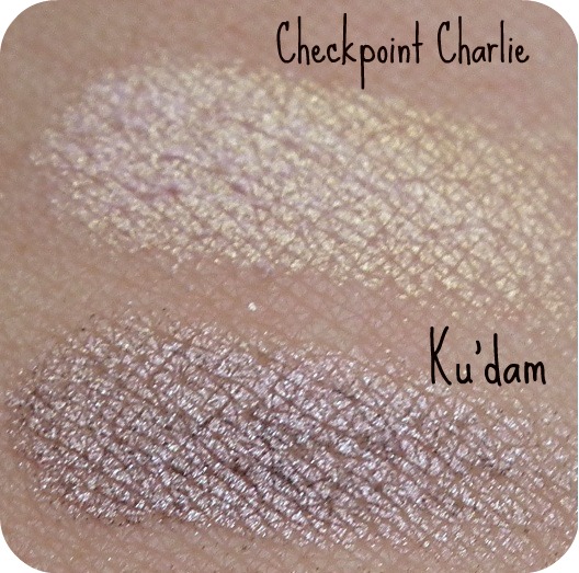
I included two different pictures to show the multidimension of the colours. I have to say I am incredibly impressed by the way a cheaper brand has made these colours look bi-toned from different angles!


I am not going to describe all colours, because you can see them by yourself from the swatches above. However, the only mat is Am Alex and it is a useful matte: I really like brown or taupe colours in matte. The rest are intricated shimmers/metallic colours in 3 cooler tones: Tiergarden, Brandenburger Tor and Ku'dam. I consider Berlin Wall and Checkpoint Charlie as 'I've fooled you colours': looking cool at first glaze but with a warmer reflection from a different angle.

Best example of an 'I've fooled you colour' is Checkpoint Charlie: look how cool and white it looks from this angle:

Only to look as the most gorgeous rose-gold sheen I haven't seen in a while from this angle: 


Ku'dam looks so pretty in that picture as well. Such a perfect mauve metallic.

Strangely, the names remind me of the time the cold war was still going on (the 1980s). I know these points still exist for tourist sake (or historicans) but they were mentioned a lot in the 80s when Berlin was still separated in East Berlin (communist Sovjet) and West Berlin (kapitalist Western).

Anyway, this is the best makeupfind I have found in a while and I am quite enthousiastic about it. I wonder if Berlin itself will be just as enticing as the palette ;D.

So, what do you think? Should I buy another palette and put it up for a giveaway soon? (I couldn't let my readers with no access to Catrice miss out on this palette, right?)

Saturday, 21 May 2011

Something Shu about Catrice

In one of my  last drugstore visits I noticed something slightly familiar in the makeup department.

Yeh, I love my more-difficult-to-get cosmetics that I have to order from outside Holland a lot, especially the refined technologies in Japanese (and Korean, and Taiwanese) cosmetics, but I do like some brands that are available over here as well. Especially when they are quite good.

To continue, I noticed that makeup brand Catrice had something quite Shu Uemura about their new packaging:


Ok, the Catrice is a tad bigger than the Shu Uemura, but the design is quite copycat!

And the quality is quite good: Shu ME Brown 885 on the left and Catrice Swimming with Dolphins (Loooove their names):

I haven't swatched the far right one with the gorgeous decoration. It is from their Wonderland Collection and is called C01 Fairy Dust, because I might add this one in a near future giveaway (Watch this space). But this Dutch blogger made a fab swatch of it, so check it out! (here)

So, imitation is the highest form of flattery? Well, if the quality is really good and the price is right, for me, yeh, sometimes...:D