Wednesday, 29 September 2010

Madara Sun Flower Tinted Moisturiser

A few days ago I posted a kind of wish- and doubtlist of the new things I would possibly like to have for fall. The Madara Sun Flower Tinted Moisturiser was one of them. Looking at my yes-factors compared to the no/maybe-factor, I was quite sure that I probably would enjoy this product.

Well, it is a product that is available in the Netherlands, so I was able to swatch it a couple of times and contemplate deeply if I needed it. After writing everything on the blog, I concluded that I had to try this product.

Shortly, I was lured in by the whole natural connection talk of the company...let's see what they have to say about Madara's philosophy:

Our perception of beauty is enshrined in our motto - deeper than skin. It means beauty that goes beyond external appearances. It is beauty wrought from health, love of life, warmth and summer, which you carry with you and is seen by everyone you meet on your way. Beauty is genuine emotions, a sincere smile, a kind and loving disposition towards people and nature. It is femininity and beauty in its deepest sense. It is a beauty which would not offend meadow flowers. It is the wisdom and force of nature.

I believe that this phisosoply is absolutely beautiful: a form of beauty that is lit from within. 

But ofcourse, Madara's promotion picture does not go for a 'girl with a nice personality' and inner beauty (which, as most people know, when someone say that you have 'nice personality' they often mean that they say 'do not count too much on your appearance'). 

They opted for the beautiful girl surrounded by grass...

I do like her choice of lipstick, though...she has a bit of red in her hair and she has freckles, so the bronzy/orangy lipstick looks perfect on her. I also like the peachy-terra blush on her cheeks, although it would not look so good on my cooler skin.

Opening the package, the tinted moisturizer has a pump dispenser that is hygienic to use.

Photobucket

The ingredients look promising:

Photobucket

The tinted moisturizer is darker than my own skintone. I deliberately picked the darkest colour: Sun Flower. I could have picked Moon Flower, but I wanted a sort of faker product to use when I feel a bit pasty.


It takes a long, long time before it finally seems to blend into the skin. It stays on a bit too long for my liking.

Photobucket

Testing the product at home, I felt a bit insecure about my purchase. It looks a lot more like a highlighter product, such as MAC strobe cream, than a tinted moisturizer. In this swatch, you can see that it looks glowy and bronzy from afar:


However, close up.....

Photobucket

Ooooh my G...how did I missed that during swatching? It has fine glitters in them!
(you can click on that picture to see a more close, and scary view of my skin and Madara Sun Flower applied)

Shortly, I had applied this product all over my face when going outside on a day with sunshine. I should not have done that, because I was a semi-kind of disco-ball.

Ok ok, it was not that dramatic, but I did not find it subtle enough to qualify for a 'unmade-up' look that I normally want from a tinted moisturizer.

It makes a wonderful night-time product, though. But for me at daytime, it looks a bit unnatural to me. At least, when applied to the whole face.

Moreover, I am not too charmed of its scent: it is a herbal garden gone psychedelic and it lingers quite long under my nose. It was ok when I swatched it on my hand, but under my nose it was absolutely too scented. With this O.D. on herbal scent, I also had the feeling that my skin itched a bit...I am not sure if that is psychological, or physical. But whatever reason caused the slightly itchy skin, it was related to wearing the tinted moisturizer.

Uhoh, I am always aware when reviewing something that the cosmetic company will not be to happy about it. But hey, I aim to make honests review based upon my personal opinion, and not for the sake of promoting products and receiving things for a good promotion..

Moreover, it proves that not everything natural will always work like a charm. Sometimes, the beautiful and natural ingredients can be even more hindering to the over-sensitive skins. 

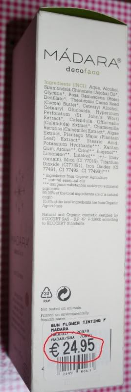
Overall, after all my serious contemplation I thought I would be absolutely happy with this, but I threw another € 24.95 down the drain.
Photobucket
24.95 euros...and it did not work for me
I probably can still make someone happy with it during a give-away, but boohoo, I wanted to make myself happy with this purchase.

Overal, I asked myself the question if this product would qualify for the normal girls with flaws, instead of models and gorgeous women only...?

Answer: Mmm, well...it perhaps can work on someone else, but it did not work for me.

Sunday, 26 September 2010

KIKO Double Glam eyeliner in 01

In a couple of my  posts in the summer I had been quite enthousiastic about KIKO cosmetics. This Milanese brand has been my personal discovery of this year, as I like the combination of affordable cosmetics with (often) a good quality product.

KIKO released a couple of new products for Autumn 2010 as well. It was already released in August this summer, so I was happy to pick up some items. Mind that this brand is only available in the South of Europe and some places in Germany. Unfortunately, I do not live there (yet) so my access to this brand is limited to the visits I pay and the generosity of some friends who blissfully live there.

One of their newbie things is the Double Glam eyeliner pencils. They released a selection of 6 pencils in various colour and combinations of colours.

the packaging in whimsical purple tones

KIKO double glam eyeliner in 01: ingredients

I picked up colour number 01, as it matches my scarf that you see on the background...

KIKO pencil and D&G sharpener
Just kidding, I picked up 01 as I found the brown side of the pencil to be incredibly unique.

L-R: brown pencil swatch; gold swatch; gold and black blended
It is not your standard deep brown colour. It looks like it has been mingled with a charcoal colour. That makes it perfect on days when a black eyeliner is too much drama for me, but I still want the deepness of a dark pencil to make my features stand out.

The gold is a lovely deeper gold. I find it a bit lighter than the gold eyeliner from Illamasqua 4-colour palette that I showed this week. I probably have 1 other similar colour like this, but I think the texture of both pencils is amazingly creamy. That is also visible in the swatch on the right side, as I was able to blend the charcoal brown with the gold. Result: a brown with golden undertones.

Price-wise, it can almost not be beaten. I paid approximately 6 euros for this pencil.

Overall, the pencil combines the perfect duo of colours I can use as a base (brown) and a eye-popping colour (gold). The colours are quite Autumn suitable, and the dual sided pencil format makes it perfect for bringing some eyemakeup with you without carrying around too much bulk.

Thursday, 23 September 2010

Rouge Bunny Rouge eyeshadow in Bejewelled Skylark

Today I will post a mini-review on Rouge Bunny Rouge eyeshadow in Bejeweled Skylark.

One of the brands that caught my attention from beauty-blog nation lately has been Rouge Bunny Rouge. It ticks most of the boxes that attracts the niche beauty product users: difficult to get, from a mysterious country (Russia), a intriging brandname, and a bit overpriced.

I had read my first review on Rouge Bunny Rouge a couple of  months ago on prettyaddictedblog in this post, and I was attracted to the hint of redness in the brownish colour Bejewelled Skylark. Red is opposite colour of green, and my eyes are green so red can make them stand out a bit more.


The case is in a sweet and simple black and white packaging with the feathery flower as a decoration. It is a bit fingerprint-prone. It does not directly scream luxury, but does not look cheap either.


I am often amazed by the way cosmetic brands distribute around the world. This is a Russian brand, but they are made in Italy. OPI nailpolishes have something similar: they are a US brand, but are made in a city in the Netherlands. However, I pay a fortune for OPI over here and if I import it from the US I pay a fraction of the price.

The colour is indeed a reddish brown. Actually, I find it more red than I expected, although it is beautiful.


The swatch, on me, actually looks more like a reddened bronze than the brown with a hint of red.


I have read several raves about the superior texture of RBR, so I had my hopes up for this eyeshadow. And honestly, it is a good textured eyeshadow, but it is not the best eyeshadow ever in my opinion. I miss that bit of buttery-ness that I find with some eyeshadows that I have. I do not have extremely taut eyes anymore, so I love it when an eyeshadow is a bit buttery and softer.

However, I am spoiled with some Japanese brands, Korean Brands (Banila especially) and even TARTE, so I have a bit of eyeshadow experience. Moreover, what one person finds a fantastic texture, might be something else to another person.

I have some positive notes as well. The dryer texture makes it more suitable for making a good eyeliner. It mixes wonderfully with normal water and mixing medium. And, something I have read in the raves: the eyeshadow does not change after using water on the pan...that is something that is quite remarkable, because some eyeshadows completely harden after using water upon them.

So, before I caved into buying the RBR eyeshadow, I had been trying to recreate the colour and look with one of my TARTE eyeshadows from the Day-to-Night palette. I believe I should have left it like that, because the brown is more neutral and the texture is softer and more velvety.
Tarte Day to Night palette: My fave colour circled with red (or rouge, without the bunny)
Still, I always like to know if a product can live up to the hype. And yes, it is good, but I would have picked another colour if I knew it would have turned out this reddish.

Wednesday, 22 September 2010

Newly Arrived: Illamasqua Art of Darkness 4-Colour Liquid Metal Palette 02

It's alter ego time

Yes, I have been indulging modestly in some of the collections released for this autumn. The modesty part has not been too easy,  however, I decided to pick out some newer things from the fall items released instead of constantly repeating buying similar products and colours.

Well, Illamasqua often has a way of making novelty colours and items.There has always been an element in their brand that I found to be quite innovating and attractive. The whole idea of linking to that dramatic 1930s era of decadence and drama. The idea of skipping the whole 'natural-but-not-really-natural' makeup look, which I often like for daytime purposes (and many people with me), but actually can be quite uninspiring when you really want to dazzle.

Weirdly, I had been skipping their Autumn 2009 release based on their name: Distopia. I kind of like my utopias, even if they would stay only a dream of bliss. Unlike that, I was quite drawn to the 2010  'Art of Darkness' description...Darkness is alluring...a tad dangerous but also a period of new interpretation of things. 

Further on, I really like the colour scheme that Illamasqua composed for their Art of Darkness collection.

One of the products that was top on my lust-have list was the 4-colour Liquid Metal Palette in 02. It was not directly released with the other items from the collection, so I had to wait eagerly for a couple of days before ordering it.

When it arrived I was slightly amused by the black, curly snippets in the box. It resembled a bird nest of a bird of prey, or a kind of prehistorical/sci-fi future birdlike figure that flies around in the art of darkness.  So, my first picture I wanted to place the palette in that birdness as a sort of egg...

Illamasqua Art of Darkness in its nest
 I love the packaging because of its green overglow on the black packaging. I do not want to throw it away, even though it has no use in storing it.

Backside has the fantastical description behind Art of Darkness. Oh, I see that they discuss the mythical things (ha ha, there are those bird-like figures I mentioned) and Elixir of Life....Ohh, Elixir of Life...

Illamasqua Art of Darkness 4-colour liquid palette: "do not use on lips"
 So, what has come out of the eggs?

These are absolutely the type of metals that appeal to me. It has a darkened teal, a rusty gold, a beautiful maroon and a cobalt-blue shade.

Illamasqua Art of Darkness 4-Colour Liquid Metal Palette 02: inside
Up close my still virgin-like palette
.
The cobalt-blue:

 The rusty gold:


 The reddish maroon:
 My favourite one: the darkened teal

 The swatches:
swatches
I have no review to write about the palette yet, as it has just arrived and I haven't been able to test its endurance (etc).

Illamasqua 4-colour liquid Metal Palette 02 is available on their website, and it will probably be released at the other distributors such as ASOS.com and beautybay.com soon.

Sunday, 19 September 2010

5 new things I would like to have...

Writing a beauty blog means that I try more cosmetic products than the average person around. There is just something about the lure of a product that has HG potential (holy grail), even though you are perfectly satisfied with the things you already have.

Although I can be lured easily in buying something that I fancy, I still have certain wishlists around for things that look quite interesting, but are
  1. quite expensive or are financially not the best thing to do
  2. unneccesary (most of my buys are unnecessary, so that excuse does not really work, although some products are even less necessary than others).
  3. require difficult strategies to order 
  4. am not certain about if my skin would tolerate/like, or if it would flatter me...etc.
  5. have a waiting list...
  6. has gotten mixed reviews
  7. are from a brand I haven't had any success with in the past...
Still, they are interesting enough to remain on my wishlist.

1. Kose Addiction Autumn 2010 blush in Gorgeous


Yes Factor:
I have had good experiences with Kose Addiction before (posts here). And after seeing the online colour picture of Gorgeous, I think I am smitten: it is that certain mauve/rosy colour that could suit my complexion perfectly.

I am also enticed by the blush in Good Girl. Oh lord, I think I want all the eyeshadows as well! For the Lady Gaga lovers there is even a colour named Bad Romance in a shockingly matte purple. Still, I think I would skip the Bad Romance and go for the smoky Twig.

And this time I am not too critical over the promotion picture. The collection is London-themed, so it actually makes a bit of sense they put a rock-chick kind of girl on the promo picture. Although, one of my favourite bloggers, old cow from worshipblues, is a Londoner as well and she would make an awesome rock-chic too. And it makes sense, fashion bloggers are having a larger say in the collections of the grande fashion house and get bags named after them, so why not putting our favourite beauty bloggers as the faces of cosmetic products?

No or maybe factor:
Price: This blush is Expensive with a capital E. And what if there are chunky glitters in it, or the colour is not what I expected it to be. Oh, and don't I already have a thousand of these colours yet?

2. Tigi Catwalk Sleek Mystique Straight Collection.


yes factor:
I have straight hair. So depending on my need I want to pretend it is either curly or wavy, or even get that extra-straight look that was fashionable a couple a years ago (straightening irons, anyone?). It would be blissfull to create that poker-straight look that girl is sporting on the promo-picture without those damaging thongs...

no or maybe factor:
Gosh, how many hair products can a girl have? I need to finish at least one product in order to excuse myself from making another hair-product purchase. And which product to take? All of them? And what if it is a craptastic product again?

3. Edward Bess eyeshadows (or actually the whole line)

Yes factor:
One of the more Niche brands that has been popping up at the beauty blogosphere lately. The eyeshadows are available in six neutral colours, that I like. The swatches online look fantastic and covet-worthy.I have read that they are extremely suitable for the ladies that aren't in their twenties anymore, so a flattering eyeshadow is something covet-worth

no or maybe factor:
 The price. The lack of colours and the dupe-ability of the colours. I am also afraid they will not show up on my eyes. It's perhaps a bit too niche for me. Or worse, I might love it so much that I want to buy the whole collection, something my wallet would not really recommend.

4. Madara tinted Moisturizer


Yes Factor:
You can see it on the promo-picture: it has that whole meadow-type of wholesome-ness. I actually want to be that natural-looking girl with her flawless skin and dance in the summery meadow with her probably perfectly handsome and flawless boyfriend.

And the ingredients:
 Baltic St.John's-wort, plantain, chamomile, algae and rose water, as well as cocoa and jojoba.
 Wow, St. John's worth is a natural form of prozac, so I might even get chirpy by wearing the moisturizer!

It gets even worse: this blogger is so enthousiastic about the tinted moisturizer that it is almost impossible to resist. And darn, the reviewer is a model as well, so she must get offered or made up by lot of products so she must know something about all types of foundations and tinted moisturizers.

No or maybe factor:
Price, ofcourse. And something I mentioned before in previous posts: I think the review I mentioned before is absolutely fantastic, but honestly, that girl would look good with her face covered in the cheapest and most unflattering makeup ever. They would even make such a look trendy when she is wearing it. I like to know if it looks good on real girls with flaws (which makes it a yes factor again, to buy it in order to find out/review for the blog).

5.  Burberry Cape trench jacket.


Yes Factor:
Capes...getting in touch with my superheroine side that must be somewhere. And Burberry, what is the epithome of style by owning a Burberry jacket. It is also Fashionable with a capital F.

No or maybe factor:
This jacket has DREAM ON written on it. I won't even mention the p-word again...it is the ultimate expensive item that I cave, and so impossibly obtainable that I placed it on the end of my wishlist. I might mention my blog birkinbagbeauty, but I haven't even got a midge of Jane Birkin's financial means or the wardrobe she probably has acquired over the years...
He he, a girl can dream, can't she?

Well, what are your wishlist items for this autumn? And why have you been slightly hesitant of buying them?

Batiste dry shampoo in Brunette

For today I am going to give a mini-review on a product that has to to with hair. I normally shy away about reviewing anything that has to do with hair. Simply, hair does not interest me so much and I believe there are more experted people with better hair that can give some excellent reviews.

Still, one of the things my mum told me is to keep it clean, fresh and tangle free. And even if the 'dirty' look can look absolutely fantastic on the shorter hairstyles, I have longer hair and I like to keep it clean and shiny.

Clean hair can be a hassle when you have a busy lifestyle, are travelling a lot, or are at a festival in the summer. Dry shampoo can be a good product for extending your hairdo another day.

Another plus with dry shampoo is that they can be quite volumizing, which is a good extra.

For people who are not a light to middle blonde, and those are probably 85% of the world population or more, a normal dry shampoo is actually not a way of  looking really fabulous after application. Ok, there are the clearer varieties these days, but most turn out to be that white stuff that looks a lot like dandruff.

I have been familiar with Bumble & Bumble coloured dry shampoos, which are effective but expensive. So when I spotted a Brunette version from Batiste I was eager to ship this from the UK.

Batiste Brunette
Judging on the colour scheme of the can, I had a bit of hope that it would turn out to flatter warmer brunette colours. The can is in a auburn-kind of colour, and I would clearly define this as warm.

And did it live up to my expectations?

 Ehm, I displayed the effect of the dry-shampoo on my fake fringe (or bangs). The fringe is made of real human hair and matches my hair a lot. I circled the Batiste spray with the red lining.

Batiste brunette on the real hair fake fringe (circled in red)
As you notice, the hair colour is somewhere beteen a middle golden blonde and a light golden brunette, that depends on the colour definition that the larger companies of hairdyes give out. I noticed that my colour of hair is classified as brunette in Northern European countries, but in Southern European countries I am suddenly a middle-blonde.

To continue my two cents on the Batiste Brunette. Well, It looks terribly ashy and does not look shiny and fresh in my opinion. Actually, it looks like I have been rolling into barbeque ashes and put it in my hair. So, instead of the dandruff-look I have a woman-who-rolled-in-fire-ashes look...what an improvement!

Now, this is only a test on a particular shade of brunette, so it might work on the real cooler tones of brunettes. Still, I will go for the clearer varieties in the future, or spend a bit more on Bumble & Bumble.

Well, no big loss in the money department. It costed me £3.00. 

Still, I would like to see more companies to cater for Brunettes, redheads and raven-haired beauties. It is not only the blondes that need a suitable dry shampoo. And a good budget version in a suitable colour, or clear formula, would actually sell and give those companies more profit. Sounds reasonable, doesn't it?

Monday, 13 September 2010

Banila Co Autumn 2010 Love Affair palette in F07

After showing you some of the lip-products of Banila Co Love Affair line last weekend, I can finally move to the Pièce de résistance of the collection. What else to be incredibly excited about than the gorgeously laced palette.


I have been a huge fan of Banila's palettes since my first buy. One of the things I love about the eyeshadows in the palette is their buttery texture, which makes it glide over your eyelids. It is vibrant after application, even without a base, and makes it fuzz free for carrying around.


For non-Korean readers, the back of the pallette is probably not really informative. Most information is written down in Korean.

Now honestly, I often skip the promotion information written on the back and I rarely look at the ingredients of makeup either, because I trust the bigger makeup companies for not letting me put on any toxins on my face.

Still, with any penetrative product, such as creams/lotions/serums/ect, I DO read the ingredient list, because my dear old skin is really picky and often reacts quickly on lots of chemical and even natural elements. And although I probably do not react on Parabens, I often get that icky feeling when parabens are included in a cream.

The packaging of the palette is really gorgeous and is absolutely suitable to carry around and for making your girlfriends a bit envious. The pinky bronze surface with that beautifully deep bronze lace motive, it is absolutely delightful!

However, the content has to match up its exterior. And as I said earlier, I have been liking Banila's texture of eyeshadows in the palettes, so I would probably not be dissapointed in this purchase.

(Although, sometimes a company decides to 'make over' their products and meddles too much with an already suitable products, so it actually dissapoints compared to the earlier version).


Although I have been happy with Banila's quality of eyeshadow, I often have found some colours not really suitable for my colouring or I could not find it to be age-appropriate (obvious glitters? No no no)

But the rave continues, because I am absolutely delighted with the composition of colours in the palette.


I have made some close up pictures, which is in the same order as the palette.

First, A dark mauvy brown laced with gold shimmers....Next to that one, a softer and lighter lilac mauve.


In the middle: a beige shimmer that probably works as a highlighter on any browbone (or other places you would like to highlight). And a whiter, more matte, vanilla shade that is the more subtle kind of highlighter for that "Look-I'm-naturally-pretty-and-I-do-not-wear-any-makeup-at-al"-look.


At the right: the smokey ladies. They do not really match up with the warmer side of the left and the middle, but they are fantastic for making that quick and sultry smokey eye that you often like to create for a date or night out.


Now to the swatches:


It seems like the left side of the palette starts of as suitable for persons who like their shades warm, the middle are quite neutral and light, and the right side are silvery and smokey.


I am intrigued how the silvery colour (no 5) has that green undertone, that makes it more interesting. I find this colour the most unique in the palette, and I believe I do not have such a shade yet.

Pigmentation-wise, they did not dissapoint (gladfully). Although the 4 shade in the Vanilla colour is not as pigmented as the other ones. That is something I encounter in most palettes, that one or more of the colours seem to lack pigmentation.

Perhaps you can even find more representative swatches on the same side I have linked before: here.   Click on the small 'Love Affair' label, and then you will get on a page with the title 'event'.

This is a winner palette for me! And even though my real life is lacking any love Affair of importance, I can continue to stay enamorated with the beautiful colours and the gorgeous packaging of the palette.

I bought this palette on Gmarket over here.