Saturday 30 October 2010

Pouting nudely: Etude House LucidDarling Lipstick in 11 Barely Beige.

In my last Gmarket haul I was reasonably taking some advantage of the Etude sale that was going on. And when it comes to Etude, the LucidDarling lipsticks have been one of my favourite items. Ofcourse, when the colour is right, and I am quite picky when it comes to lipstick shades.

The latest release that was added to their already existing LucidDarling range was colour no. 11 in Barely Beige. I browsed the internet and the Etude House Korean site for some swatches. I found some (although I cannot link directly to them) and I was in the middle if it would suit me or not. Well, with that sale going on, why shouldn't I try it?

I love the nude lip-look! For example, the next picture.


She reminds me of 90s supermodel Helena Christensen, btw.

Now I disgress! Well, what I want to say is that a nude lip is something I normally do not reach for a lot, even though I love the look.

Reason: you either have to be utterly naturally gorgeous (example above), have a volumous pout or have that fantastically good base makeup with a dramatic eye-look.

I am normally too lazy to layer on a heavy dose of makeup. Oh, I am not a natural beauty either and lacking a bit of pout. Nude lips can make them look invisible. Noooooo do for me! I need that bit of pout to stay visible...


You probably know how the LucidDarling's packaging looks like. I have been blogging too much about this, so I continue to the colour.


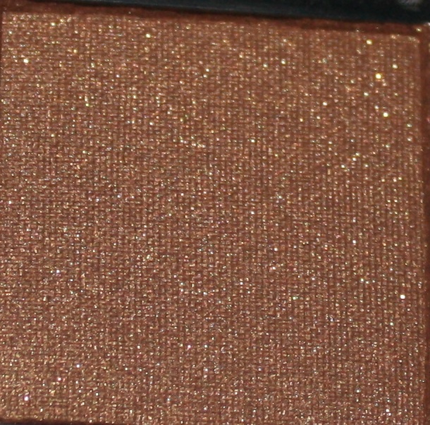
The colour is a brownish beige. The close up shows the colour a bit better.


Aww, where did that tiny smudgy came from? Well, I already spoiled it virginal state by swatching it for the blog and testing it on my pucker, but I would love to have it flawless for the blog picture. (pouts my nude pukker).

The swatch on my pale arm. (vampire alert...gosh, I'm a pale person)


One of the things I love about this lipstick is that the pigmentation is so strong without leaving out that lovely sheen. Sometimes those heavily pigmented babies can come across like these matte and sheenless products. This is not glossy, but a glowy lipstick.

Weirdly, it looks a bit pinker on my arm and on the picture than it does in real life. You might even wonder why I describe it as a nude?

And you are right. I think it might be a less nudy colour on someone else than me. I have that bit of flush on my mouth, so everything that hints toward beige will go nude coloured on me.

For example, the wonderfully acclaimed MAC Hug me! That is a YLBB (Your Lips But Better) on lots of girls, but a NLAW (Nude Lips and Worse) on me.

So, do I like this colour. Oh, I am not really sure. As I said, I have that flushed lip state, so when the lipstick wears a bit off on the sides, or I open my mouth, the contrast between my natural state and the paleness of the nude looks a bit too much.

That makes a nude lip colour even more high-maintainance to me than, ohhh lets say, a sassy red or a vampy maroon shade.

But I know that the LucidDarling is quite lastproof, so that will diminish the constantly looking in the mirror and applicating new lipstick process.

I bought mine on gmarket (over here). It retails for 9000 won or $8.24 at the time of writing.

Thursday 28 October 2010

Bright and Happy haul

It sometimes pays off being bored and spending too much time on the internet. ;P


For instance, this beautiful haul has everything I have been lusting for...(ok well, you know...I'm fickle so I might be lusting for new products within a second). They were all on sale. I just had to spend some time going through the ASOS beauty sale section to find these gems.

The best thing, the nail polishes were only about 2 euro or less, and normally these Ciate's are around 7 euros! The purple one is Megan (yes, that Megan Transformers-movie woman...eeek) and Lily is the turquoise one (Lily Allen ofcourse! Luv her).

Names aside, I love the eyepopping colours that are subtly rebelling against autumn fashion rules of nature-esque but moody colours.

That gorgeous Illamasqua eyeshadow in the right corner? That is Tango. She is one of the few non-matte eyeshadows from their brand. Even better, it is one of those reddish brows I seem to be addicted of lately!

In the middle....drumroll...from Illamasqua's latest release: the liquid eyeliner...

That stuff is really good...it stays on like superglue and has that shiny glow that makes it look superblack and lustrous. Can you believe it was on sale as well?

So, what colour to paint my nails with? Feisty turquoise Lily or purply Megan....? Or make a skittles composition of both?

Saturday 23 October 2010

Golden browns: Kose Addiction Dolce Vita & Kanebo Kate Dual Eyes BR-1

I have been craving a beautiful golden brown colour for a while. In search for perfection for that smooth eyeshadow that looks deep but natural on my eyelids, I have been buying some new colours....

After being not to happy about my Rouge Bunny Rouge purchase, my obsession just grew bigger and bigger in order to really find an eyeshadow that would fit me. So addiction and a good eyeshadowy texture brought me to.......Addiction....Kose Addiction.

I have been quite happy about my previous two Addiction colours I bought. Those two were actually in the metallic formula, ME. I wondered it the pearl (P) formula would be just a superior.

We all know that those online charts that the cosmetic company puts online can be somewhat or totally unrepresentative of the actual colour you will get. Luckily, I found that Lokolo had some good pictures of swatches of most of the Addiction eyeshadows. You can see them over here

I found three colours to be incredibly beautiful Keshil,  Fudge and Dolce Vita. Keshil is a darkened grey with a teal/silvery/blue lustre. I was craving the browner colours, so that left me with Fudge and Dolce Vita. I opted for Dolce Vita as it looked like the subtler one of the two.

Well, as you can see from the pan, it is a brown with a tiny bit of redness and some golden shimmer.


Before I continue, I will go to look at the Kanebo Kate Dual Eyes first....

Kate is my favourite of the Kanebo line. I love the personality behind the brand, as it is a bit less kawaii and more sharp and edgy than its sister Lavshuca, and not as pricy as the other sister Lunasol. Often, the pigment of the eyeshadows are good and buttery, and are suitable for adult eyes.

And after Kathy from Lotuspalace gave the heads up on the latest Fall addition, I almost did not hesitate to go for another golden brownish colour.


The packaging is simple and a bit on the cheaper side. Lunasol  makes more glam and luxurious eyeshadows, however, I find the pigment to be lacking depth oftenly.

The lighter, highlight side is bigger than the deeper, brown side. I find this a bit of a pity.


Swatches! from both the Kose Addiction Dolce Vita as the Kanebo Kate Dual eyes BR-1


First, the Kose Addiction:
I think the colour is absolutely beautiful. The colour is a toasted golden brown and has almost a hint of green in a certain angle. The golden shimmer makes the colour come to live on the eyelids, thus has a quality that almost looks natural.

However, I am a bit dissapointed of the texture, especially compared to the Neverland and Flashback eyeshadows I already have. I could not really blend it easily after it had been applied, so it looked a bit of stark on the eyes. I don't know, it looked like a cheaper brand eyeshadow. Not the usual quality I am used of when wearing their ME Neverland or Flashback.

So, I will stick to the ME versions from now on, or just continue to be happy with the two ME shadows I already have. (Oh, I still might want to buy Keshil in the future)

That is why I swatched it next to the Kate Kanebo Dual blend- the brown colour. First, ofcourse you see the difference in colour: a brown is not just a brown! But as makeup lovers, we all know that ;D.

That is why I am giving a partial heads up to the Kate Dual Blend eyeshadow duo as well. Look at the swatch! It has that velvet lustre that makes it look good on the eyes. Compared to Dolce Vita, it has lustre instead of sparkles. It is a velvety colour that is pigmented from the first application. Further more, you can blend it easily without it feeling 'caked on'.

I said I gave the Kate a partial heads up. Why? As a Duo, the partner is not really as strong and as vivid as its browner mate. The beigy colour is simply a bit too light, too unpigmented. You can see that on the swatch as well.

I do not find this too much of a hindrance. I like the highlighter colour to be as subtle as possible. However, if you like your beigy highlighter to be pigmented you will not really like that side of the duo.

In Kanebo's Kate case, that is not so bad, because I paid $12 for it on Adambeauty.

I purchased Kose Addiction Dolce Vita  for ¥3150 (about $36) on ichibankao.com.

Wednesday 20 October 2010

Birkie got mail

I finally got some interesting mail today....


Fellow fans will probably recognize this box by a blink of the eye. Yes, it is Gmarket!

How could I have been enthousiastically blogging about an Etude House sale without indulging a l.ittle bit myself? Well, I have to do my blog duty in order to shop something form the sale as well...that is only fair to my readers....;p.

Since I never tried anything from their nail polish line, and I was craving some new hues, I had to buy their latest colour in G 011.

This is an incredibly complex colour: Think a Khaki brown with hologram glitters.... I certainly have nothing like this in my collection, and believe me...I stopped counting since I reached a 100 bottles of nailpolish.


Look at the close up of the bottle...that is sparkling rainbowy goodness inside! It is the perfect combination of a autumn murky colour with a splash of happy colour inside!

A novelty item: the latest eyebrow definer!


I picked up a new colour from an old favourite of mine: LUCIDdarling lipstick.


I went for something I see on lots of fellow bloggers, but normally skip myself: False lashes!

I picked the clear line from the Wonder Volume collection. Etude House falsies have been receiving some good reviews online. Well, I normally do not wear falsies but they probably come in handy on when I want to drama-it-up during clubbing!

Ok, and they had a good deal: so I could not skip upon a new palette of eyeshadow colours!

This is from their LUCIDarling Fantastic Gradation Eyes collection. I picked no. 5. That is a new colour for fall. Still, it would be new for me anyhow, because I have never tried their LUCIDarling eyeshadow palette range.

Etude House made no promises about goodies or extras, but I received this wonderfully big package of cotton pads.


I also received a sheet mask...

I do not have any reviews for you yet. Well, I have to say that the nailpolish is too gorgeous for words. I haven't been this delighted about a nailpolish in ages!

Friday 8 October 2010

Sale spotting: Etude House 30% off at Gmarket

Hey hey,

Etude House on Gmarket is having a short time sale on everything Etude! 30% off on all items....


That is a good sale! It takes a short while, only today and tomorrow, so I am going try something new from them for even a better price...

Etude House can be found at gmarket.co.kr over here . They have been releasing some new things for fall. Oh, and this blogger has some swatches from some of their new products (the highlighter, a 3-in-1 blush/highlighting compact, eyebrow product and eyeshadow pigments) and this girl has swatched the new LucidDarling lipstick colour in 11 golden beige. I'm really tempted!

So I will absolutely have a look...✿◕‿◕✿

Monday 4 October 2010

Scentational

I would like to show you one of my late summer purchases that I absolutely cherish.

Photobucket

This gem is named Princesses of Venise...(from the even more whimsically named brand Roméa d'Améor)

These princesses absolutely must have smelled lovely, because the translation in a perfume is a mix of feminine fruitiness and soft florals. It makes it a bit easier saying goodbye to summer...

Although I cannot believe real Venice actually having a similar scent. I unromantically think that Venice must smell like the canals of Amsterdam, and that is not the best scent ever. Lingering water, tons of tourists and the Meditteranean sun probably had its effect on the Venician waters (never been there, though).

However, these princesses must have had their best perfumistas serving them at their wishes, making the best blend suitable for their royalness.

One of the images that came close to the character of the scent of a princess is not one of a 16th or 17th century royal member, but a baroness of the 20th century

Donna Maria Beatrice Olga Alberta Caracciolo
Donna Maria Beatrice Olga Alberta Caracciolo was known for "her elusive combination of childlike innocence and soigné charm".

To me, that is precisely the character that Princesses de Venice has been conveying to me.

More information about this fantastically interesting 'Outrageaous Olga', and why she was so outrageous, can be found on this must-read site on socialites throughout the ages...The Esoteric Curiosa.