
 |
| Catrice The Berlin Collection |
Remembering my old love for anything palette and anything in cute boxes I was instantly drawn at the latest release from German budget makeupbrand Catrice. I like Catrice for various reasons, but mostly for they relatively good quality for a affordable price. Adding that Catrice packaging has become much sleeker (example here) makes it an attractive brand.
 |
| Catrice palette formula: a good clone format I've seen on other brands |
It seems that Catrice have ventured on a new field, palettes. To make me more enthousiastic, because I am a realy city-a-holic, they connected their palettes to big cities. This time they didn't went for the most obvious of the 3: normally they are Paris, London, New York but included cities such as Berlin and Sydney. I still believe they got London as well, but London is too good to miss anyway :D.

So why did I pick Berlin. Most because of the colours, but I really like the description of the city as well: "The capital with its exceptional city spirit allows anyone and everyone to live by their own rules". Brilliant!

Opening the box gives out 2 blush colours and 6 eyeshadow colours. The thicker box might make you think that there is an extra layer beneith, such as the brands like Urban Decay do. But that isn't the case. I am not complaining because the whole box is under 7 euros.

I picked this box because I liked almost every colour in it. And every makeup and palette-addict knows that such a deal is hard to find: because there are always colours or formulas that you feel 'meh' about in a palette, don't you?

First the Blush:
They included one shimmery blush, that doesn't contain glitter <BLISS> so it works for the non-perfect skins out there as well.
The second one is a matte colour.

Blush Unten den Linden is a shimmery rose-toned bronze that can work as an eyeshadow as well. I think this one will be better suited when my skin is (faux)tanned.
Siegessäule is just PERFECT for my winter skin. It creates a light windswept flush that reminds me of Bobbi Brown Slopes, only a bit lighter and more subtle.
The eyeshadows:
I included two different pictures to show the multidimension of the colours. I have to say I am incredibly impressed by the way a cheaper brand has made these colours look bi-toned from different angles!


I am not going to describe all colours, because you can see them by yourself from the swatches above. However, the only mat is Am Alex and it is a useful matte: I really like brown or taupe colours in matte. The rest are intricated shimmers/metallic colours in 3 cooler tones: Tiergarden, Brandenburger Tor and Ku'dam. I consider Berlin Wall and Checkpoint Charlie as 'I've fooled you colours': looking cool at first glaze but with a warmer reflection from a different angle.
Best example of an 'I've fooled you colour' is Checkpoint Charlie: look how cool and white it looks from this angle:

Only to look as the most gorgeous rose-gold sheen I haven't seen in a while from this angle:
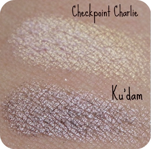
Ku'dam looks so pretty in that picture as well. Such a perfect mauve metallic.
Strangely, the names remind me of the time the cold war was still going on (the 1980s). I know these points still exist for tourist sake (or historicans) but they were mentioned a lot in the 80s when Berlin was still separated in East Berlin (communist Sovjet) and West Berlin (kapitalist Western).
Anyway, this is the best makeupfind I have found in a while and I am quite enthousiastic about it. I wonder if Berlin itself will be just as enticing as the palette ;D.
So, what do you think? Should I buy another palette and put it up for a giveaway soon? (I couldn't let my readers with no access to Catrice miss out on this palette, right?)
1 comment:
It's very pretty and quite nostalgic! Yes, you should give one away!!
Post a Comment