
I got myself a new blushie!
Oh, it had been a while since I had gone cheeky and I had kept it fairly affordable. Since I've been hearing such raves about Three Cosmetics, I was absolutely all about trying out their newest range: Cheeky Chic blush:

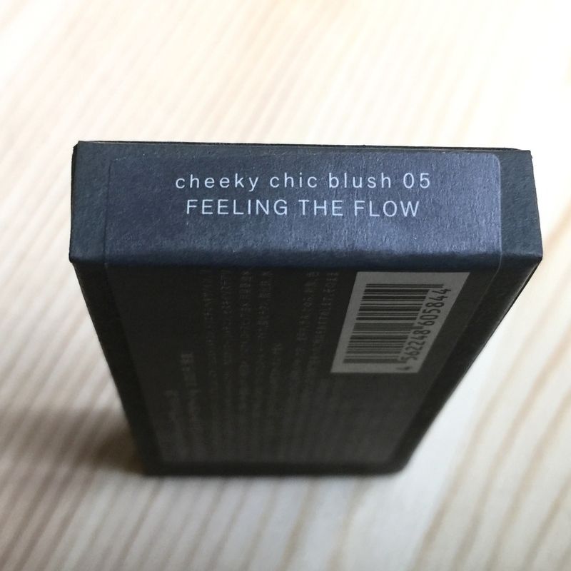
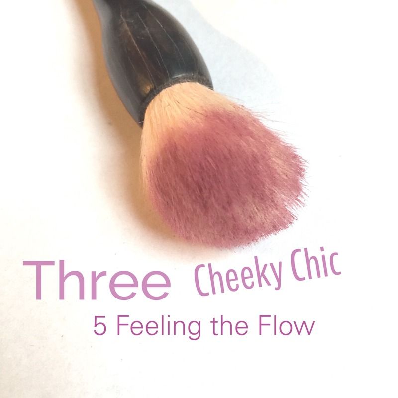
I went for their darkest colours in the most pretty wine-infused rose colour: 05 Feeling the Flow.
For their spring line they picked a Wanderlust Wave theme and they had this refreshingly Cool girl theme.

The semi-spiritual names of the blushes are a bit see-through, but I still loved it enough to cave in my first Three blush buy!
Three Cosmetics has a minimalistic approach to their packaging:

It is probably the antidote of Jill Stuart princesy and shimmery exterior. But it is also a bit bleak compared to other minimalist Addiction by Kose. Addiction has a microflecked black case and looks slightly more glam.
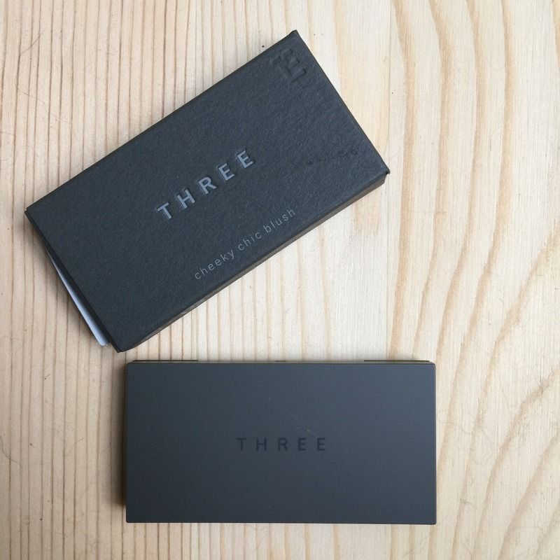
So yeh, I was slightly underwhelmed by the dark grey plastic case. But I was more curious about Three's inside so let's go on.
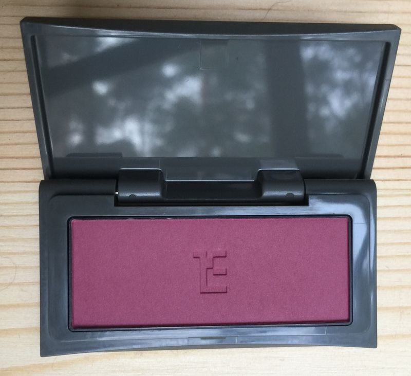
At first glance, it looks like a matte burnished deep rose that could also been mistaken as a light wine colour:
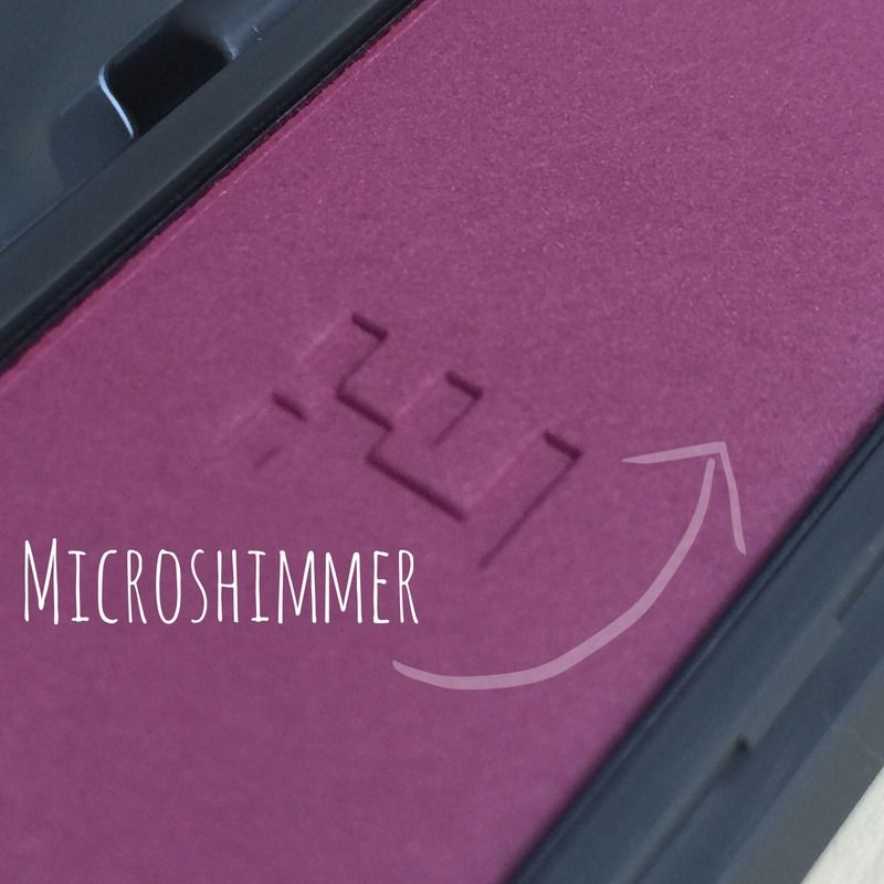
When looking closer, you can see tiny microshimmers in the pan:
So now it was the brush-test. How would the pigment 'grab' on the brush?
I used a Rae Morris Mini Kabuki: it is not the softest out there (thinking Chikuhodo Z series) but it is also not your scratchy brush. I just wanted the pigment to behave with a mid-quality type of brush instead of 'being spoiled' with the best one out there.
I had to swirl around a couple of times to get even pigmentation on the brush. I first thought it would be my technique. And, perhaps visible, it lacks some blush at some spots.
Swatches (post-holiday skin and yes, I tanned a bit so it's probably NC 35):
 |
| Top: 1 application | bottom: 2 applications |
First, I love the colour and how it looks on NC 35 skin. I recon it would look fab on lighter skins, giving it a snow-white or icy wind effect.
The microshimmer is just right from keeping the blush fall too flat. It is still, in my opinion, more of a matte blush.
I am underwhelmed by the way it blended on my skin. I tried it with makeup under it first, but I could not seem to blend in well. I am spoiled with Surratt Artistique blush (see here) and some other fab high and mid-end versions, but hey!
I'm supposed to buy one of the top-league blushes out there (review here, here & here). Which makes me wonder, this is a new formula: did it change from the older Color Veils one?
Perhaps I gotten a dud, however, I'm not sure how the people who raved about their earlier Color Veils are going to feel about this. I never tried the old one so I cannot compare.
In general, I still love how this colour is different from the rest of my blush-wardrobe. It is a perfect shade if you want your cheeks to pop a bit more and I am all about cooler hues these days. It does take some work to blend and that is not the type of work I expect from that pricerange.
So as I said, underwhelmed...
1 comment:
Awww! That's too bad that this didn't meet your expectations. I feel the same way about a similar color I've bought before but it was too hard and wouldn't blend or apply evenly which makes a dark color terrible!
Post a Comment