Showing posts with label swatches. Show all posts

Sunday, 12 June 2016

Back to Kate with Kanebo Kate Forming Edge Eyes in GD-1

Hiya Kate Kanebo, 
I've missed you...


I started Birkinbagbeauty with a strong interest in Asian Makeup. Through the years I have developed new interests like organic beauty and other. My love for a well-balanced eye-palette from Japanese crafship has never died... 

In current times when more is absolutely too much in makeup (My own opinion), where contouring has gone to slightly "Prisilla, Queen of the Desert" proportions, lips are plump and matte and eyes are never seen without falsies, I started to long for a fresh face with a cute bit of blush and a delightfully soft but sparkly eye.


That does not mean I compromise on quality: just look at the photo above and see that perfectly pressed state of eyeshadow-ness.


I picked the golden and warmer toned palette: There's something typically summery about a golden hue on the eyes.
 
For the subtle fun, some microshimmer:


I am both impressed of the soft and buttery quality. However, for becoming more and more spoiled with strong and vivid pigments, I do find this palette a tad sheer. The mixture of a slightly bronzy gold, nice neutral brown and a buttery cream makes it easier for me to go eyeshadow again.

The effect on eyes is similar as the promotion photo:


I'm glad to have reunited with Kanebo Kate again. Although we never left (think Mascara primer), I've gone too neutral on the eyes lately with just a bit of pencil. A small palette like this makes eyeshadow not intimidating, but a fun way of bringing the eyes into focus again....

Monday, 11 May 2015

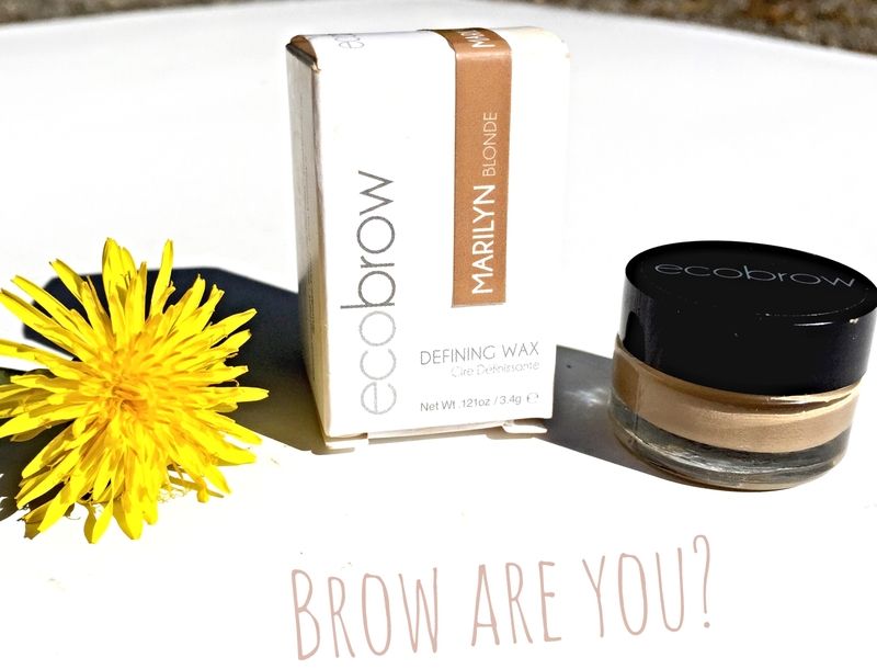
Brow-sing Naturally with Ecobrow defining wax in Marilyn


Brow are you?  Good? Then let's talk Ecological Brows or Ecobrow Defining Wax:


Eh,  a bit of a trite pun on words but how about the idea that first impressions count and people always are about that 'eyes are the mirror of the soul'. In that case, eyebrows are the framing of the mirror and they can be really important to characterize the face. The quintessential example would be Cara, but how about the 1920s moviestars who defined their fragile femininity with a thin & droopy brow:

source: Here & more brow-xamples
  I personally do not think "one brow fits all". Even if everyone seems to be into the Cara-brow, you got to consider her facial structure is delicate enough to pull off a masculine brow without loosing her femininity. I personally go for some more space between my eyes and a bit of a curve for a slightly more feminine shape on my squarer features. I still aim for a natural looking brow, ofcourse!

But let's take a look of how I liked Ecobrow as a brow-definer.
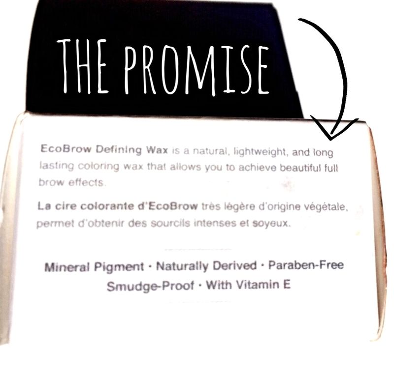
  • Natural
  • Lighweight
  • beautiful Brow effects
  • Smudge Proof
  • Naturally Derived
Ok, last claim is "Naturally Derived": will that be true?

sorry for the smudgies
In the first place I find some of them sounding chemical, like Neopentyl glycol. Wiki says it is an organic chemical compound which sounds to me like a oxymoron...Organic and Chemical? Mmm... 

But I believe in their ecological sustainability just for the fact that I bought it from Sephora. You gotta trust the Americans for totally forking out all claims and promises like truth...or else...lawsuit!

In that case, let's check the "beautiful brow effect" it will bring me! Hurray!

Colour:

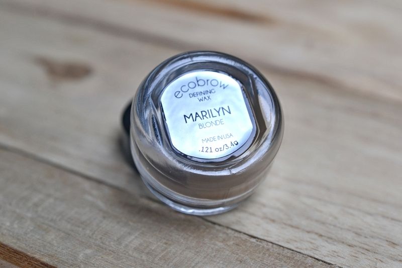
I picked Marilyn because it is the lightest colour around. I'm not a natural light blonde but my eyebrows have always been naturally light. I've been trying the darker ones, but they make my face look too stern. I simply want my existing colour to look thicker and shape some femininity in them.

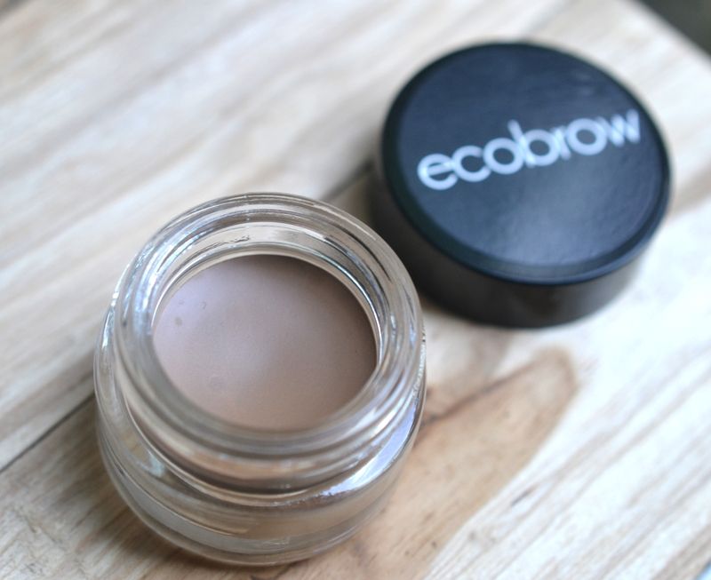
The colour inside is a taupe with a slight hint of green:


The green won't show in the pot, but in the comparing swatches you will see it.

Comparing swatches:

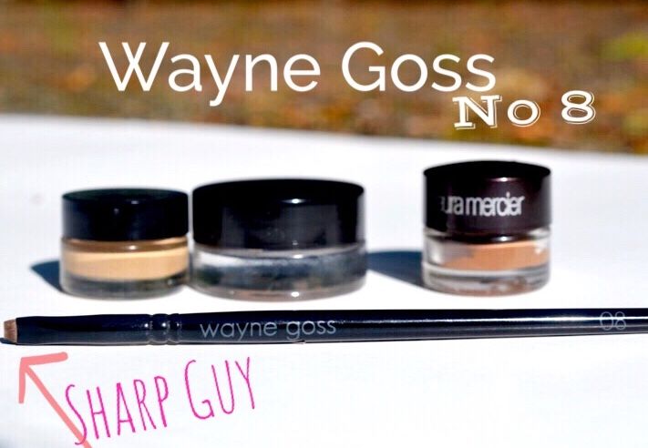
I picked up my other blonde cream formulas to compare with Ecobrow Marilyn. They are:
  • EB = Ecobrow Marilyn
  • ABH= Anastasia Beverly hills Dipbrow in Blonde
  • LM= Laura Mercier Brow Definer in Fair
My tools of the trade is my latest, supersharp Wayne Goss No. 8:

Swatches:

EB: Ecobrow Marilyn is the lightest of the bunch. I am so thrilled of this lightness because it totally fills my brow without altering the colour. Moreover, it is neutral enough without leaning either cool or gold.

ABH: I never noticed how greenly tinged Anastasia Beverly Hills in Blonde was before this swatch. I don't mind because it makes the drawn-in hairs appear more real. The colour is slightly on the cooler side and a bit too dark for a total brow-fill. It is pigmented enough to draw good hairs so I can alternate this with a lighter colour.

LM: Laura Mercier in Fair is a wonderful lighter colour with more warmth than Ecobrow. I do think it fades more quickly and it does not draw the hairs as vivid as Ecobrow.

Revisiting Promises:
  • Natural: Mostly
  • Lightweight: Very
  • beautiful Brow effects: YES!
  • Smudge Proof: Up to 8 hours with a natural fade
  • Naturally Derived: I'm not specialised enough to prove it is but it has not been proven otherwise yes so I guess...
General review:

I have really fallen in love with Ecobrow Marilyn. It gives my brows a natural but sculpted look I love without looking fake. It last for a long time and I do not have to worry putting unnecessary chemicals on my face.

 Verdict = LOVE it.

Wednesday, 30 July 2014

Show me your Marbles...

A week ago I received my 1st Sephora haul...Ofcourse, L.O.V.E...Some highly unaccessible brands like Tarte are finally within my reach.

I also added the Becca Beachtint in Raspberry, which got me into looking at my other marbles (=marbled blushes).
Somehow, like primary school, it feels like showing your marbles before playing a game.


1. Clio ArtBlusher in Light Brown 3: I purchased some of these minerals in 2009 and forgot about these.
2. New Cid Cosmetic Glow Mini in Sirocco
I received 2 of these Mini's as a GWP. In fact, they're both gorgeous colours, longlasting and travel friendly
3. Terra Del Sol No 4:
Once hunted these down at the German Douglas based on rave reviews. Sometimes the chase is better than the catch because I cannot remember using this one
4. Banila Co de la Couture Face blusher:
Korean know how to do BB balms but they also had a good selection of marbled blushers going on.
5. My other New Cid Cosmetic Glow mini: in Coral Crush
6. Prorance Finish Water glow in M16:
Korean & from Gmarket
7. Stila Cheek Duo in Pink Glow
8. YES, my newbie Becca Beachtint Souffle in Watermelon that spurred on the marble-post.
9. My other Clio Artblush in 2 Pink
10. Lioelle Marbling Blusher: Guess from which country? Yes??
11. SkinFood All over Muffin Cake Finish: The Koreans probably think that girls wanna smear cakemix over their face...but it makes a sweet glow for sure.

And, unlike the glassy marbtles of our youth, we can swatch these:
 
1. Clio ArtBlusher in Light Brown 3: Sometimes Marbles are Matte! And this colour looks like the perfect matte bronzer/shader.
 2. New Cid Cosmetic Glow Mini in Sirocco: A glowy highlighter with peach undertones
 3. Terra Del Sol No 4: Sweet, I
 4. Banila Co de la Couture Face blusher: A golden peach
 5. New Cid Cosmetic Glow mini: Sort of NARS Deep Throat dupe without the glitter
 photo aae3d73c-c49f-4920-ae79-e2797e469a3f.jpg
 6. Prorance Finish Water glow in M16: This colour has a slightly frosty finish in a warmer pink (peachy) glow
 7. Stila Cheek Duo in Pink Glow: Both shades are more traditional blush than mineralized finish. In both cases, they hint towards coolness with the top shade slightly bubblegum & the bottom Raspberry
 8. Becca Beachtint Souffle in Raspberry is both longlasting, well-blending and in that perfect shade of fruity pink that hints towards berry-ness.
 9.  Clio Artblush in 2 Pink: WOWZA, how did I forget about this one. A deeper pink-berry.
10. Lioelle Marbling Blusher: The funny thing about Marbled blush is that you cannot always forsee the outcome being swached. This one is highlighter whitish pink with a slight frost.
 11. SkinFood All over Muffin Cake Finish: Slightly warmer/peachier highlighter hue than Lioelle and probably a lovely blush on N 15-20 skin.

 photo 64ad2bb1-0553-4317-adbb-06ef77c1d08f.jpg

It's good to know that I had no dupe for my new Becca Beachtint Souffle (no 8). I'm also happy to rediscovered some old new vintage marbles around.
More detailed review of:Clio ARTblusher in 03 Brown

So what have you been rediscovering lately?

Monday, 10 February 2014

Kanebo Kate Colouricious Diamond in BR-3

I seem to have a penchant for mauve-toned palettes:  When Kanebo Kate reworked something 'Beyonce'-liciously named  palette and added some Diamonds (hi Rihanna) I caved again...


The palette is in Kate's neutral and more grown-up theme and has some excellent glow-factor:


The palette exist of some flat pans (1 & 2) and some heaved pans (2, 3, 4) that remind me of baked eyeshadows. I actually think that they are baked eyeshadows, at least peachy shade no 3 gives that flecksy "baked eyeshadow" quality.

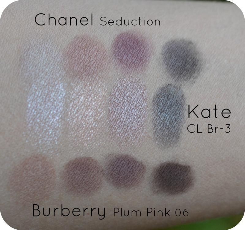
I thought the colour-scheme was most similar to my Chanel Seduction palette  and Burberry Plum Pink 06.

My intuition has been right, however, the glow/lustrous/flecks/glimmer factor is a different story.
cool winter light ouside, no sun
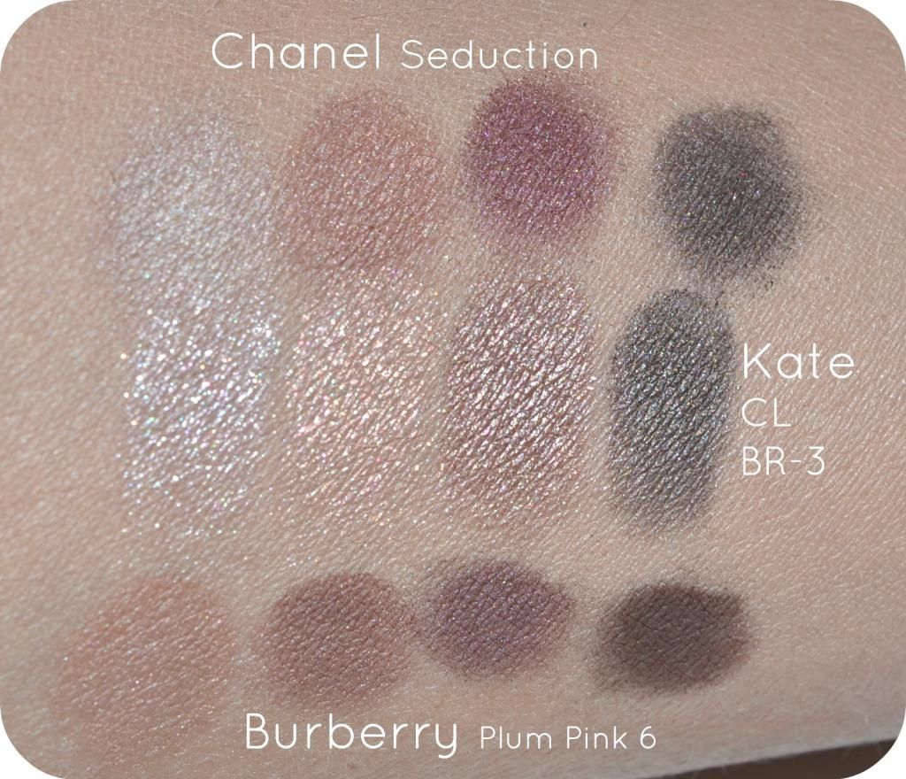
The difference in glowiness if most visible under flash-light:
This is what makes Japanese eyeshadows so desirable in my opinion: they bring an amount of glow to the eyeshadow that brings eyes and forward.

Visuals:
  • Kate CL Diamond shade 1, the whitest. It has a fleck-sy texture which shimmers silvery cool. It absolutely doesn't compare with either Burberry nor Chanel. Chanel lightest colour is sandy brown and opaque with a hint of a glow. Burberry is a peachy sand with some opacity and a low amount of shimmer.
  • Kate CL Diamond shade 3 is a fleck-sy peach with a cooler undertone. I think this one layers well in the middle of the moving eyelid for an extra hint of light. Again, Chanel & Burberry do not compare at all. Both Chanel & Burberry are opaque. Chanel's 'peach' lingers towards terracotta sand and Burberry's directs towards a brownish mauve.
  • Kate CL Diamond shade 4 is a gorgeous shimmery mauve with a silvery undertone. I think it is opaque but nowhere near the matte-ness of Chanel & Burberry.  I like how shade 3 lingers between Chanel & Burberry's 2 & 3 colours.  Burberry's 3 shade hints towards a burgundy mauve and has a gorgeous glow, but not as shimmery as Kate. Chanel 3 is a couple of tones deeper and has a hint of pinkish glow over it.
  • Kate CL Diamond Shade 5 is the strongest colour qualitywise with a high opacity and still a good amount of interesting, multidimensional glow. It looks like a cool brown in the pan but on the skin it is almost a greyish black. Perhaps the multiflecks have something to do with it. Chanel's 4 shade comes close to it but only a more matte & a one-dimensional glow. Burberry is definitely more brown.
Texture/quality:
Kate Colouricious Diamond applies almost creamy but as you can see from the swatches (with crappy brushes -> my good brushes were getting a wash) they do need a bit of work and an extra layer. There is a difference in opacity which makes some colours more prone to fade than others (colour 1 & 2). The darkest colour is a dream in both texture, blending and the multiflecked quality that is still office appropriate.

Overal:
The theme of a mauve-based palette is similar to the likes of Chanel & Burberry but the colour payoff and the glow is quite different. I really like this palette because the sublime shimmer brings my eyes more alive and it blends a bit easier. I mix Kate up with either Burberry or Chanel for a mauve-ish eye.

Conclusion:
Fame isn't always better and the shyer sisters of the cosmetic branches have some good values out there1

Availability:
I got mine from adambeauty.com for $17 
 
1Ofcourse, when living in Japan Kate might be just as big as Chanel or Burberry but hey...for the Western posse

Thursday, 6 February 2014

Addiction by Ayako - Eyeshadow in Meeting at Dome 071 (Eivissa Dreams '14)

Last week I had Kose Addiction Spring 2014 Eivissa Dreams
 on my radar.
It didn't took long for me to order my first eyeshadow from this collection: Meeting at Dome 071.

I opened the lid full of expectations of receiving a warmish taupe ~Something like in the promotion photo:

Reality has been slightly different. I will show you numerous photos of different angles and light-positions so show you the complexity of this eyeshadow.
Opening it for the first time: It looks like a mix of platinum and silver or more of a cool colour than a creamy taupe.

Direct sunlight ~ a cooler silver:

Slightly shaded/partly in sunlight ~greyed and speck-ly:

Same as above, only close up (see the turquoise sparkles!)

Another direct sunlight shows a slightly creamier/aspect of the silver:

Swatching it brings out a silver with a hint of mauve:

Same above, only close up:

Another swatch photo in a mixture of shade & light outside:

Verdict:
I think it is easy to conclude that this colour is far from a warmer colour as in the promotion photo. That doesn't make it a dud: au contraire! I love the complexity of this platinum that lights up in subtle turquoise, silver and lavender/mauve or a slightly smoky dept in various lights and shadows. I tried to compare it with my existing eyeshadows and thought about NARS Lhasa, but that one wasn't even close. 

I think it will make an awesome Ibiza colour as it works brilliantly in warm sunlight, and gets the smokey dept during the evening.

As for the quality and longevity: I adore Addiction by Kose's eyeshadows on this part and this one is just as brilliant: buttery smooth and the specks/glimmer is suitable for young and slightly older.  It holds for 8 hours with foundation underneath (like my swatch photos) and I have to try it with Edward Bess eyeprimer to see if it holds even longer.

Conclusion:
I'd almost book a flight to Ibiza to show off this eyeshadow.

Sunday, 26 January 2014

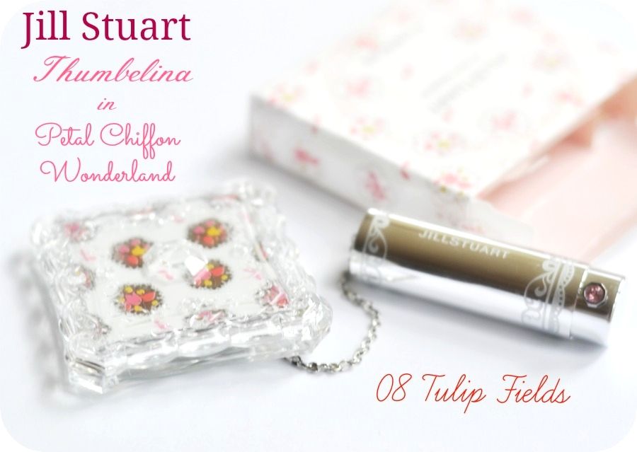
Jill Stuart Mix Blush Compact '14 Spring in Tulip Fields 08

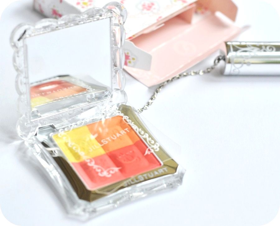
I could write a whole story about why I bought this blush or I could show your the photo:
Or, ooooh Spring or It's purrrty!

But I'm not that superficial and it gotten a bit of nationality mixed in as well: Tulip Fields!

Nothing more quintessentially Dutch as a good dose of Tulips!
Still there has been a lot more that made me buy my second Jill Stuart Blush. I like my first and for some reason I haven't made a repetition buy until this one. Reason: price, and perhaps the bit of OTT on cuteness. I do not trust too cute & too pretty too much, or call me superficial on the superficial [get it?].

And there's often a good dose of innocent-talk when buying Jill Stuart. However, I've been getting used to this with Rouge Bunny Rouge. Even a mature/sleek brand like Laura Mercier has been talking about 'innocence' for Spring '14 so there must be something in the air that longs to the pre-twerking/booty-instagram era...Perhaps Tulips?

In Jill Stuart case, there's the Fairytale:

And the fairytale princess Abby Lee Kershaw as 'zee face'
Often a model who is a face is not that often used for body-modelling, but in Abby's case she's been a Victoria's Secret model too: Well, you definitely need a body to walk those shows so talk about lucky genes.

So I'd been discussing "inner beauty" as a resolution but the inside of the box is also decorated with cute flowers:

Which brings me to the palette:
I like that brush on a leash: it makes the innocence of the blush a bit more cheeky...

Close:
 

& Closer:


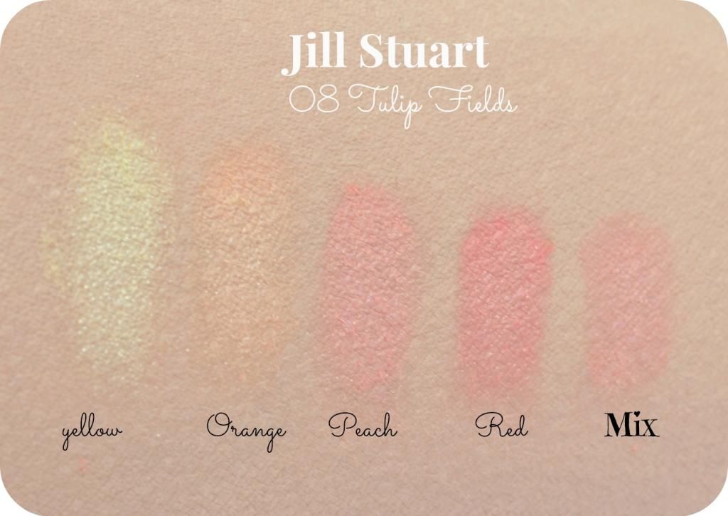
And the swatches:

I have been really surprised about the colour payoff and the glowiness. The closest match I can think of is the Le Metier de Beaute Kaleidoscope blush. I got to compare both of them. And I have to make better photos when there's some real light again but *people* it's January and I was too eager to swatch/discuss/review/blag about it today!

I was slightly worried because I've been reading Driveller's Kate review on the way she fell for pretty with Paul & Joe, and gotten "pretty [useless] balls" (my quotation, btw). Also, I was worried about too much 'orangy' tones but I love how the mix works out. Also, the 'red' colour is not as frightingly red as I imagined: it's a pinkish red that I love.

This will make a versatile palette when travelling: the yellow makes a slightly shimmery/speckly highlighter and the rest have enough versatility to use on it's own, and make the most 'universally peachy' combination when mixed.

Or,  a Fairytale come true! Now only the 'return of innocence' again...

Tuesday, 3 December 2013

Pupa Princess Palette for eyes

*looks like teen-spirit?*

I'm slightly nostalgic for finally being drawn into a spontanious purchase of a palette based on the mere premise of pretty colours. It doesn't happen a lot these days as I meticulously investigate the whole beauty-blogosphere before I plunge in.

This created a mature and well-defined collection of Burberry eyeshadows, Rouge Bunny Rouge and the creme-de-la-creme of Le Metier de Beaute Kaleidoscopes.


 And then this cutie came along with the right set of colours and princessy atmosphere.

(also, I still like Pupa...a fab Italian brand)
Pupa Princess Palette: no flash, natural light, no sun
 No further investigation...the swatches on my arm looked really good and pigmented and for a mere €17.50 I bought in on the spot.
Pupa Princess: flash
I'll keep the suspense going on if it really was such a good decision...not in a Hitchockian way but still..

What remarked me is that Pupa's 'face' is a girl that reminds me of fashionblogger Chiara (theBlondeSalad):

 
Though, now Chiara isn't that blonde anymore, but probably still salady

Anyway, the Chiara-fication is quite prominent in Italy as she is one of their main export-products in fashion. Although Marni, Miu Miu and Prada will have a good stand in this field as well.

That brings me to the palet again...Instructions are quite clear in the brochure:

And the 1 to 8 format in their eyeshadows. (9 is an eyeliner)

Sparkly & flash closeup from 1-5 (will make better photos soon):


And 6 to eyeliner:

Swatches over RBR Time Defying Foundation in Wheatgrass:

The pigmentation of the colours are a bit of a mixed bag. I probably swatched the best ones before my impulse purchase. However, it still makes my purchase a good value.

1. One of those imo useless white (tinge of rose) shades that's oftenly in the Adult-industry sector or on girls who are a bit clueless/beginning with makeup. Ok, slightly exaggerated, but not the most convincing of highlighter eyeshadows. It is quite pigmented but I do not like the frosty/chalky quality of this.
2. A more buttery variant of 1...still a bit too chalky for my liking but it merges to a more skin-appropriate colour
3. Now we're getting to better shades (no greys intended)! A softly flecked golden peach that makes that delightful pop on the middle of the moving eyelid.
4. YES to PEACH! A slightly pinked peach that got me into this palette. The texture is buttery and it has the right satiny luminescence.
5. PEEEENK! Talking about fashionbloggers (and yes, I read them) that it will match those heap of pink coats they have been buying lately. Guilty, I  have one too but bought it before the hype. As for the texture, satiny bordering to matte.
6. "I thought it was Taupe" but it translate as a brownish Charcoal on my skin. Mmm, odd. It lacked a bit of pigmentation, however, it glides evenly over the skin so the texture is quite good.
7. Darn, look at how pretty it looks in the pan: pure mauve delight! And then it has this uneven application (3 swipes on that little spot).
8. Mmm, Chrismassy hue! A purple with multicoloured flecks with a reddish base...An even application and the flecks are not glitters but shimmery goodness.
9. Wow, an eyeliner in a palette that is actually good! This eyeliner stayed put after I washed the eyeshadows away. I love the matte-black colour, it swipes perfectly in one swipe without feathering and that is even in the 'crooky' part of my arm.


Conclusion
Not too bad for an impulse buy. It does need a good primer and not all eyeshadows have a good quality about them, but some are surprisingly nice. The plastic case is a bit cheap but for the price it's a nice addition for someone beginning in makeup or people who will always need more nuances in their eyeshadows.