Showing posts with label illamasqua. Show all posts

Friday, 26 September 2014

Shades of Shader: Surrat Blush artistique in Grisaille 10

Let's talk working horses today...

I've gotten myself a new shader after shading happily for 2 years with Burberry Earthy. It happened in the field of "It's not you, it's me" and "I want to try out new things".

I had been tempted for a while by Surratt's makeup-line. I've seen several reviews of the gorgeously neutral Grisaille online. Perhaps neutral shader's are not the most exiting part of makeup but for me they are one of the more essential parts:
  •  I consider myself quite vain
  • my nose is not so small
  • However, I don't like the idea of plastic surgery involving hacking into bones
 -> good ol' makeuptrick: the shader!


I only had 2 types yet (older review here): Burberry Earthy & Illamasqua Disobey. I liked both but only went for Burberry Earthy later as it is glowier. The only thing about Burberry blush is the strong rose fragance. There are de-scenting methods by using charcoal (see DrivelbyFrivol about it) but I haven't been bothered. I'd rather try something new, especially after the superenabling GWP that Liberty had on.


I'm still going to compare the three of them.

Gathering of the pans:

At first sight I can seee Burberry being the warmest one leaning towards brown. Illamastqua looks ashier and slightly deeper. Surrat looks the most neutral and even slightly cool.

Swatches: (3 swipes of blush over Lunasol Cream foundation OC20)

 photo DSC_1151.jpg
 photo CSC_1150.jpg

Oh, what a difference! In the first place I notice Illamasqua having a weird grey cast I have not noticed before. It seems it oxidises quickly: perhaps it"s expired.

Burberry & Surrat both have a gorgeous soft glow that mimics healthy skin. I consider the microglow particles to be similar (for closeup, click photos).

Burberry is a tad warmer than Surratt. I think it still qualifies as a blush and it looks stunning on redheads (see here). In that case I think someone should be really cool-toned to make Surrat Grisaille look like a blush. Surratt Grisaille is a real shader colour in terms of neutral undertone. Is it a real taupe? I think so. One coat is light enough for the lightest skintones: it builds up to a good deeper tone that will shade up to N 35 skin.

Best of all: Surratt is scentless! The texture reminds of of the luxurious Japanese brands like Three and (from memory swatching) Suqqu blush:

I mean, look at the picture above. It's so smooth and the shimmer is so delicate and neutral (a platinum colour? not sure).

It stays on for 8 hours & more on prepped (primer/foundation) skin and does not oxidise. It fades evenly after 10 hours.

Conclusion: one of the better purchases of the last months and a classic in the making.

Sunday, 9 September 2012

Autumn nails: what's new?

Most beautybloggers have an eye on fashion as well. I'm no exception and I was quite curious what I would be going on for face makeup...

But somewhat easier, how to accessorise my nails?

courtesy Vogue Fr

I went to Vogue Fr. and they showed some returns of the classics: (link)
  • Red nails- quite big during Fall. No extras with nailart-caviar, etc...just classic reds.
As for the returns of previous seasons:
  • Khaki, blacks and taupes: ah great, not that much investments.
I did buy the latest Chanel in Vertigo:


I couldn't resist, even though I probably have a dupe. I love the reference to the film with Kim Novak building up the tension in true Alfred Hitchcock style. Will his films ever date?


I really like the trend they called 'outsider', but basically quite logical with the so-called 'winter-pastels'...a sweet candy pinkish lavendel: 


As I said, there is not that much nail-art featured. Somehow I was surprised about that, because I have seen a lot of Military clothing in the shops. I personally wouldn't like to dress up like someone who has to defend the country against possible enemies, but I thought it would be fab for nails and so I googled and found this blogger doing this tutorial: CrazeGlaze


Wow, supercool: I brought up my other murky greens that I can pair op with my latest Chanel Vertigo:
left: Brazilian brand Ludurana in L001, Essence 68 High Spirits, Illamasqua Hectic, Creative Nail Design in 340 Okey Dokey Artichokie

Swatches in similar order: Ludurana in L001, Essence 68 High Spirits, Illamasqua Hectic, Creative Nail Design in 340 Okey Dokey Artichokie.

 In general, I think that Illamasqua Hectic will qualify as the most military based. It will look awesome on it's own but I really want to try to do my nails in somewhat similar way as Crazeglaze.

So, what beauty-actions are you going to apply in order to go with trends, or perhaps go against trends?


Friday, 18 May 2012

the Shady Bunch: Burberry Earthy 07 vs Illamasqua Disobey

I do not have lots of shaders in my arsenal. This is because I am quite happy with what I have.

 I also feel that the idea of shading should be a colour as neutral as possible, so the possiblity of colour-tweaking for the best complexion of a specific goal isn't that spectacular as with blush or lipstick.
I have exactly two colours that I find specific shaders. I use a darker foundation or powder sometimes for the occasional shading that I do, but these are the shady bunch.

Swatches, thinly applied:

left: Burberry Earthy 07: Right: Illamasqua Disobey

A hugantic picture of my lovely arm to show you the slight difference of Burberry Earthy (left) & Ilamasqua Disobey(right).

Two major differences:
  • colour: Burberry Earthy is a neutral to warm, brownish tint. Illamasqua Disobey is a brownish colour verging to the mauve spectrum, so slightly cooler
  • glow: Illamasqua Earthy has a hint of glow in it, which makes it optional to use it as a really neutral blush as well. Illamasqua Disobey is quite matte. 
Conclusion:

Two trusty shaders that are slightly different in colour and glow but not too different that you would see major difference if I would apply one on each side. I reach for the Burberry the most because of the glow and the effortless texture for daily life.

To decide what works for you is something that differs for the occassion: I think Burberry works a bit better for real life and Illamasqua's matteness will look perfect on pictures. Also, Illamasqua is easier to apply slightly thicker, which will look better on some pictures too (my makeup always looks non-existant on pictures so I always layer up a bit more to actually have a 'natural' makeup-look)

 If you want to see a thicker application of Illamasqua Disobey, you could visit Karlasugar.

Thursday, 28 October 2010

Bright and Happy haul

It sometimes pays off being bored and spending too much time on the internet. ;P


For instance, this beautiful haul has everything I have been lusting for...(ok well, you know...I'm fickle so I might be lusting for new products within a second). They were all on sale. I just had to spend some time going through the ASOS beauty sale section to find these gems.

The best thing, the nail polishes were only about 2 euro or less, and normally these Ciate's are around 7 euros! The purple one is Megan (yes, that Megan Transformers-movie woman...eeek) and Lily is the turquoise one (Lily Allen ofcourse! Luv her).

Names aside, I love the eyepopping colours that are subtly rebelling against autumn fashion rules of nature-esque but moody colours.

That gorgeous Illamasqua eyeshadow in the right corner? That is Tango. She is one of the few non-matte eyeshadows from their brand. Even better, it is one of those reddish brows I seem to be addicted of lately!

In the middle....drumroll...from Illamasqua's latest release: the liquid eyeliner...

That stuff is really good...it stays on like superglue and has that shiny glow that makes it look superblack and lustrous. Can you believe it was on sale as well?

So, what colour to paint my nails with? Feisty turquoise Lily or purply Megan....? Or make a skittles composition of both?

Wednesday, 22 September 2010

Newly Arrived: Illamasqua Art of Darkness 4-Colour Liquid Metal Palette 02

It's alter ego time

Yes, I have been indulging modestly in some of the collections released for this autumn. The modesty part has not been too easy,  however, I decided to pick out some newer things from the fall items released instead of constantly repeating buying similar products and colours.

Well, Illamasqua often has a way of making novelty colours and items.There has always been an element in their brand that I found to be quite innovating and attractive. The whole idea of linking to that dramatic 1930s era of decadence and drama. The idea of skipping the whole 'natural-but-not-really-natural' makeup look, which I often like for daytime purposes (and many people with me), but actually can be quite uninspiring when you really want to dazzle.

Weirdly, I had been skipping their Autumn 2009 release based on their name: Distopia. I kind of like my utopias, even if they would stay only a dream of bliss. Unlike that, I was quite drawn to the 2010  'Art of Darkness' description...Darkness is alluring...a tad dangerous but also a period of new interpretation of things. 

Further on, I really like the colour scheme that Illamasqua composed for their Art of Darkness collection.

One of the products that was top on my lust-have list was the 4-colour Liquid Metal Palette in 02. It was not directly released with the other items from the collection, so I had to wait eagerly for a couple of days before ordering it.

When it arrived I was slightly amused by the black, curly snippets in the box. It resembled a bird nest of a bird of prey, or a kind of prehistorical/sci-fi future birdlike figure that flies around in the art of darkness.  So, my first picture I wanted to place the palette in that birdness as a sort of egg...

Illamasqua Art of Darkness in its nest
 I love the packaging because of its green overglow on the black packaging. I do not want to throw it away, even though it has no use in storing it.

Backside has the fantastical description behind Art of Darkness. Oh, I see that they discuss the mythical things (ha ha, there are those bird-like figures I mentioned) and Elixir of Life....Ohh, Elixir of Life...

Illamasqua Art of Darkness 4-colour liquid palette: "do not use on lips"
 So, what has come out of the eggs?

These are absolutely the type of metals that appeal to me. It has a darkened teal, a rusty gold, a beautiful maroon and a cobalt-blue shade.

Illamasqua Art of Darkness 4-Colour Liquid Metal Palette 02: inside
Up close my still virgin-like palette
.
The cobalt-blue:

 The rusty gold:


 The reddish maroon:
 My favourite one: the darkened teal

 The swatches:
swatches
I have no review to write about the palette yet, as it has just arrived and I haven't been able to test its endurance (etc).

Illamasqua 4-colour liquid Metal Palette 02 is available on their website, and it will probably be released at the other distributors such as ASOS.com and beautybay.com soon.

Sunday, 20 December 2009

Wintery cheeks with Illamasqua cream blush in Seduce

Winter has fully arrived where I live, which means a beautiful scenery of snowclad trees and meadows that look both nostalgic and romantic.

What looks pretty on nature does not always look pretty on humans. Well, some girls have the loveliness of flushing at the right places in the cold, which leaves them looking glowy and radiant.

I am not one of them...I develop redness at the weirdest and most unflattering spots. Rudolph has met his mate when eyeing me up...or he might even flee away from seeing me au naturelle. I look more like a gnome who has been swimming in a muddy lake and was bitten by hungry fish...
Therefore, I need more makeup to tone down the redness and rebellious skin.

Cover and foundation are one of my better friends when confronted with icy weather. The only downfall is looking a bit unnatural and covered up, which is the reason I prefer to wear a dewy, non-shimmery and reddish blush that mimics the 'just-from-the-cold'-look somewhat.

So here comes Seduce into play: Illamasqua cream blush in Seduce, that is.

The back of the compact has descriptions of how to use the cream blush. It is wonderful for that unmadeup look, and is also suitable for skin that has no foundation on. I would not use it over powder foundation or powder, as they often are better off with powder blush.

Seduce is described as a "Warm rose pink" on illamasqua's website. Although I consider it to be a pinkish rose, I would not describe it as warm. I would say it is more of a neutral rose.

In the next pictures, it almost looks rather cool.


It is almost a raspberry colour, only a bit more pink. The blended version is neutral indeed, whereas the unblended part looks like a cool light raspberry rose. I think it would look wonderful like a liptint colour as well, which can create a wonderfully balanced face (when using one product for both cheeks and lips).


It has no glimmer, glitter or glowy particles in it. It is glowy from the creamy texture, however, which makes it a 'no-makeup' makeup kind of product.

For durablity, you can top op the cream blush with a hint of translucent powder. That makes it look like more of a glow-from-inside than a applied blush.

Overal, it is a fantastic colour for those cheeks that mimic a winter-glow. For spring and summer, I would use Illamasqua's Dixie, a corally pink, which I have written about over here (scroll down the post).

Illamasqua is available at their own website illamasqua.com, asos.com and sephora.com.

Friday, 18 December 2009

Illamasqua pencils in Classic, Sorceress and Please

After a cold week that has the true December spirit in it, I received a joint order (my friend and I) from Illamasqua. Illamasqua had free shipping for a while when ordering over 65 pounds, so my friend ordered some things and I did as well.

I ordered two pencils and a cream blush. She ordered the Satin primer and another pencil.

I had permission to swatch her pencil as well, for the blog...She is such a dear, awww.


Here are the swatches:


The fine pencil from Illamasqua is often used for eyebrows, but they can work for eyelids as well. I ordered the colour in Classic, which is a steel grey without shimmer. It is the colour on the left. It has a dryer texture than the medium pencils, although they differ as well from each other. It is only available for European Union buyers (sorry US people, but you can probably find a lovely EU person to purchase it for you)

The colour Sorceress is decribed as a rich brown-black, and it almost looks black in real life. I found this pencil to be the creamiest one that covered the skin the best.

The colour Please is a European Union edition only as well. It is decribed as a Navy Blue. I found it to have some teal undertones as well, which is visible in the swatch too, if you watch closely. This texture is not as good as the Sorceress one, which is a bit inconsistent of Illamasqua. Still, it has become creamier after a couple of uses, and the colour is such a wonderful navy with a pop of teal.

Overal, the pencils are lovely and are longlasting as well. They are available at illamasqua.com and asos.com for £12.00. The website has improved and they have actual swatches on skin, so you do not have to search all blogs for swatches. Very convienient.

Ok, have a good weekend and do not forget to join my giveaway for the Artdeco Alice diary over here.

Friday, 7 August 2009

Illamasqua surprise

Hey my dears!
I have a couple of post I am planning to make, but I have to break it down in a couple of post to make it comprehensable...LOL. Otherwise this post would be overloaded with pictures and random chatters about etsy, Japanese makeup, Obsessive Compulsive Cosmetics, Nix'ie, Illamasqua, jewellery, etc.

Last tuesday I received a black envelope, which, I know now, is a Illamasqua order. I could not remember ordering anything from them during my last haul, although my subconcious self was dying to place another order. I already suspected myself of sleep-internetting, instead of sleepwalking...did I make a mystery order during my sleep???

Then, I read the card inside, and it said something about me having "clearly good taste" and "accept these little gifts": Ok, that is big flattery and I am a sucker for flattery...bring it on, LOL (click the picture for the whole text on the card).

I also remembered one of cosmeticcandy's posts where she was having a free gift from Illamasqua as well. I thought she was so lucky and she must have ordered a million things from them before (she kind of ordered a couple of thingies...). Or she might have mentioned them having a blog...or such. I had only made two orders, and have not mentioned anything about writing about them on a blog (honestly...you guys probably think I am selling out, aren't you?).

Anyway, I love the gift, but I will stay unbiased as far as possible...if something does not work for me, or my type of skin, I will say so as well. On the other hand, it makes it easy falling in love with a company who send you freebies. I hope I can stay honest (LOL).

Back to business: I received a cream eyeshadow in Captivate. It can be described as a white colour with a grey cast: it looks like a cloud on a sunny day, somewhat ominous (with possible showers/rain inside). It is my first cream eyeshadow from them, so I am happy to look how it delivers, compared to MAC, Kose Esprique cream eyeshadows and other cream eyeshadows I have.


I also received my first Illamasqua powder blush in Beg. Beg looks really vivid in the pan, as a deep rose.


I have to think about this song when I think about Beg.


It is rather a deep colour for a blush. The next swatch is the unblended version of Beg.

Still, it is really a 'me' colour: not too warm or orangy, and not a cool pink or icy mauve shade. I blended it a bit and got a lovely pop of rosiness. Again, it contrasting on my white innerarm, but my face is darker.


I also swatched Captivate, which I would not have picked myself. However, I like this colour. I had an obsession with steely grey eyepencils for a while, and this is a type of colour a bit lighter. I applied it in my waterline, and it made an alternative for a white eyeliner. I also dotted a tiny bit in the corner of my eyes when I wore a smokey eye, which was also a nice solution when I do not want to wear shimmery white highligher in the inner corners of my eyes.
I also want to test it as a base product for my cooler eyeshadows. It might even look good with a warmer shade of eyeshadow, but that is still a testing opportunity ;p

Monday, 3 August 2009

In the land of the spoiled...

Now I have been the procastinating blogger: I haven't blogged for a full week. Ok ok, I was in Liverpool for a couple of days, and celebrated my birthday afterwards...But I could of have blogged a bit in the weekend. Oh well...

I received my second Illamasqua haul. I ordered it the 23th of July and received it exactly a week later. Nice...I ordered the medium pencil in Exert and Obscene, nail polis in Hectic, Powder Eye Shadow in Fatal, 4-Colour Lip Palette in Test, Scandal, Brink, Tramp. Also the sheer Lipgloss in Enchant and the powder foundation in PF210.

Shiny and sleek black boxes....


Those pencils are Exert (steely grey) and Obscene.


The sheer lipgloss in Enchant


Nail polish in Hectic: I love the moody, murky colour of Hectic...It will be a wonderful colour for fall!

The lip palette in Test, Scandal, Brink, Tramp (not in the right order). Mmm, I have been testing these, but I am not that enthousiastic....they are definitely MATTE. I am probably too spoiled with smooth and dewy Japanese lipsticks to appreciate these fully. The colours are wonderful, though.


I also made my second order at Unearthed, which is an Etsy store that specialised on cuffs with special skins (animal skins). My first order from them had been in 2007. I went to visit their shop again, and fell in love with this bright, pink fishskin cuff....how original and summery.

There is nothing fishy about this cuff (except that it is made from fishskin), he he.


Hello my pink fishy!!

Everything arrived meticulously packed and in a beautiful shape.
My last act of self-spoiling was...buying some products from Betsy's blogshop (Autumnmasquerade.blogspot.com).


I bought three eyepencils, one mac and two of Giorgio Armani. Sweet Betsy included a pencil sharpener ánd a gorgeous, glowy Armani eyeshadow as well!!!


Ohhh, I like all of those pencils. ♥ ♥ ♥ THANK YOU BETSY!!!!!! ♥ ♥ ♥

Continuing the pencil-mania: I also picked up the September edition of the InStyle Uk edition: it came with 2 free Body Shop pencils in black and another colour. I picked the Silver grey colour, but you could also pick the teal or purple.


I do not buy InStyle that often, because it is often crammed with Celeb-mania. I prefer beauty-mania and fashion-mania over the celeb-obsessed. However, the content of InStyle Uk september is pretty good as well: they have some wonderful previews of Autumn fashion and some refreshing beauty tips...
Do the Japanese magazines publish lots of previews of autumn during this period (mid summer) as well? I should visit my Japanese bookstore soon to find out myself ;P
Alright, a healthy dose of self-spoiling! My reviews on the Illamasqua will be posted this week. I also want to review the Jill Stuart Lip jelly in 15 as well, but I am not sure it that will be this week.

Friday, 24 July 2009

Small pre-birthday haul: Illamasqua bronzer, blush, powder

It is time to jump on the beauty blogger's bandwagon and investigate what Illamasqua is all about. The first time I encountered some information about Illamasqua was thanks to glowchaser's blog, which was about 8 months ago. I almost immediately fell in love with the 20th century era/flapper-esque imagery.

Now, after 8 months and reading what seems like a million reviews I finally caved and placed a small order. I often keep my first orders small, as I always want to see how the service, delivery and other things will work out before I am going to 'donate' my precious euros to a new brand and company. They should be worth it!

The company did not dissapoint. I received a sultry black envelope with their goodies within two weeks time. They also added a booklet with product pictures and even more gorgeous makeup pictures.

Let me return to the sultry image of Illamasqua. Illamasqua does not cater for the woman/girl who is looking for natural beauty. Anyway, Illamasqua seems to keep a certain philosophy that they consider natural beauty to be overrated...if you fake it...fake it all the way...

Illamasqua's logo

However, being a 'natural' makeup girl, I still believe that Illamasqua has some lovely items that are fantastic for making you look like yourself, but better. At least, the colours that I picked were really natural and the pigment is so fine that you will not have that caky/fakey look.

My small haul consisted of a Duo Bronzer in colours Glint/Writhe, a cream blush in Pixie and a pressed powder in PP 210.

  1. Duo Bronzer in Glint/Writhe (Sirens Collection 2009)

Bronzer products are a fave of mine during the summer holidays (see these posts). I have found a couple of bronzers that come very close to HG status, but I like a variety of bronzers for different purposes.

I remember seeing a picture of Illamasqua duo bronzer on cosmeticcandy.com, and they were absent of scary orangy or overtly baked hues. When it arrived I was delighted....


I received a rather large compact with two flattering shades of colour. I compared the size with a Mac blush compact, so you can visualize the size.


The next picture is made in natural light. I especially love the left side of the compact, which gives such a flattering light, glowy colour. The right side (Writhe) is darker, but not thát obviously dark-that-you-look-p##ped-over colour.


This close up shows the shimmers, which are NOT NARS-like and big, but subtle and glowing.


I still have the memory of the J-Lo-era, when bronzy and glowy was the best thing ever. This is a subtle way to achieve the look she was sporting then.

Ugh, the natural light was so cold, so I only have the next swatch pic to share with you (of natural light). I think it only functions to show the glowy texture. The top colour is the darkest colour: I have tried it as a shader with a light hand, and I found it looking flattering in a glowy, bronzy way.

And a swatch with flash....My inner arm is always so much paler than my upper arm and face. On the one side I wish I could have maintained that same paleness as my inner arm, on the other hand, I was able to travel a bit into the world (and consequently tanned during travelling -> sunscreen was not thát heavily applied in the ol' days as nowadays) so I consider my slightly darker face as a token of life-experience/fun.

Overal, I find it a very natural product/colours, which means that Illamasqua caters for both the dramatic makeupistas as the naturalistas.

2. Pressed Powder in PP 210

I always find it difficult to review a foundation or powdered product. What works for one person can be totally off for another person. And what about the swatches? I think it is really hard to make swatches that could be helpful for a variety of skintones.

I will still give it a shot ;D, though.

I haven't looked that much to the packaging yet, so I will take a closer inspection right now. You will receive the powder in a black box, very basic.


Inside, they separated the powder puff from the compact. The powder puff, unfortunately, cannot be put in the compact either. I do not know what to think about that. I do not use powder puffs that often for application of powder, as I find the method with a soft brush to give a better result. However, I usually choose a pressed powder for the reason that I will carry it around with me on the road. So, I think I would have found it more handy to have a powder puff that you can put inside the compact as well.


That was my minor rant. I have showed you the logo of Illamasqua in the beginning of the post, and here it is again. I love the shape of the compact, like a nipped in waist, very feminine.
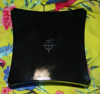

When opening the compact you will see the standard mirror.


I swatched the product quite heavily to get a good impression of the colour, but it is not that cakey in real life. As I explained earlier, my face is darker than my arm, so the colour is not too dark. Instead, I am really delighted with the colour and it is a PERFECT match for my skin at this moment!!! I love my Japanese and Korean cosmetics, but I find them catering for yellow toned skin often, so I do not receive a perfect match foundation-wise. The Illamasqua PP 210 is cool enough to match my face...so I can apply it without being afraid of skipping parts (and look totally mismatched colourwise).


I still believe that certain Japanese brands provide better texture. For example, I am very enthralled with my RMK powder foundation EX in 102, but although the deepness of the colour is really right, it is still a tad too yellow.

Again, I am comparing apples with pears, because I haven't been able to test the powder foundation of Illamasqua in this colour. However, I hope to receive and review that one soon, as I already placed another happy Illamasqua order...


3. Cream Blush in Dixie

Blush, blush, blush...I have so many of them. Normally, I favour powdered blush over cream blush. That has to do with the fact that I use powdered foundation more often than liquid foundation.

On the happy days that my skin behaves thát well that I can go out without foundation, or at times when I prefer to wear liquid foundation, I prefer cream blush over powder for a more dewy effect.

I have read so many raves on the cream blush of this brand that I was willing to buy another cream blush. The packaging of the cream blush, in contrast of the compact powder, has a window for showing the product and colour. I picked Dixie, as it was described as the most natural, rosy/corally and foolproof of all the blushes.
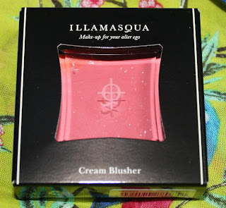
Compare compare...my dears....It is pretty large, don't you think? (same Mac blush compact as before)

The weather was not hot at all when I received the package. Nevertheless, the blush 'sweated' a bit.

Ohhh, I loveeeeeee this colour....Love, love, love it. Have I already told you that I love this colour? Yes yes yes, it is summery goodness of the perfect pinky coral!

a href="https://blogger.googleusercontent.com/img/b/R29vZ2xl/AVvXsEiTVs5x1ulb0TUY4ro7C51wJzW4IyuMCdZ_YBEgKDEQYYhnDIupvHfYa5Atf923xif4MgwLRhVsD0vNgSjJJDms7eReSHN8mXwUB-n_PwFEXfIhp8VmKdkkkXAK5bkg6c5Oc0Kf9puyQ4-o/s1600-h/dixie.jpg">
It is such a fantastic blendeable blush...it blends like a dream, even on not-so-perfectly-flawless skin like mine. I have some faded acne scars, which are so much less than they used to be, but are still a tad visible. Some lesser quality blush, especially creams, tend to 'sit' in the inperfections. Not this baby.


Moreover, it gives my cheeks such a soft, dewy appearance...I think it is youth in a small compact!

I was so glad with the result that I even made a cheek picture of it...however, I chickened out and deleted the picture. (sorry dears).

Overall, what a delightful haul! I will be waiting eagerly for my next haul to come in. I have ventured on other products this time, but you will read about it soon, if everything goes well.

(oh, and yes...I will be celebrating my birthday in a week from now...teehee...)