
I seem to have a penchant for mauve-toned palettes: When Kanebo Kate reworked something 'Beyonce'-liciously named palette and added some Diamonds (hi Rihanna) I caved again...


The palette is in Kate's neutral and more grown-up theme and has some excellent glow-factor:


The palette exist of some flat pans (1 & 2) and some heaved pans (2, 3, 4) that remind me of baked eyeshadows. I actually think that they are baked eyeshadows, at least peachy shade no 3 gives that flecksy "baked eyeshadow" quality.


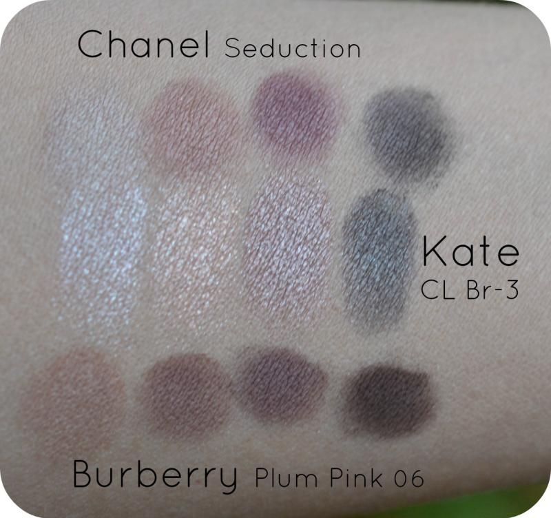
I thought the colour-scheme was most similar to my Chanel Seduction palette and Burberry Plum Pink 06.


My intuition has been right, however, the glow/lustrous/flecks/glimmer factor is a different story.
 |
| cool winter light ouside, no sun |
The difference in glowiness if most visible under flash-light:
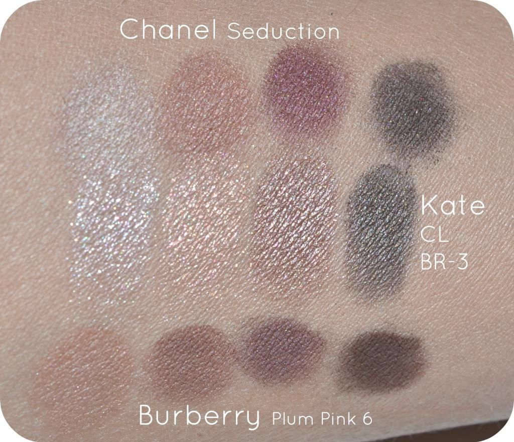
This is what makes Japanese eyeshadows so desirable in my opinion: they bring an amount of glow to the eyeshadow that brings eyes and forward.
Visuals:
- Kate CL Diamond shade 1, the whitest. It has a fleck-sy texture which shimmers silvery cool. It absolutely doesn't compare with either Burberry nor Chanel. Chanel lightest colour is sandy brown and opaque with a hint of a glow. Burberry is a peachy sand with some opacity and a low amount of shimmer.
- Kate CL Diamond shade 3 is a fleck-sy peach with a cooler undertone. I think this one layers well in the middle of the moving eyelid for an extra hint of light. Again, Chanel & Burberry do not compare at all. Both Chanel & Burberry are opaque. Chanel's 'peach' lingers towards terracotta sand and Burberry's directs towards a brownish mauve.
- Kate CL Diamond shade 4 is a gorgeous shimmery mauve with a silvery undertone. I think it is opaque but nowhere near the matte-ness of Chanel & Burberry. I like how shade 3 lingers between Chanel & Burberry's 2 & 3 colours. Burberry's 3 shade hints towards a burgundy mauve and has a gorgeous glow, but not as shimmery as Kate. Chanel 3 is a couple of tones deeper and has a hint of pinkish glow over it.
- Kate CL Diamond Shade 5 is the strongest colour qualitywise with a high opacity and still a good amount of interesting, multidimensional glow. It looks like a cool brown in the pan but on the skin it is almost a greyish black. Perhaps the multiflecks have something to do with it. Chanel's 4 shade comes close to it but only a more matte & a one-dimensional glow. Burberry is definitely more brown.
Texture/quality:
Kate Colouricious Diamond applies almost creamy but as you can see from the swatches (with crappy brushes -> my good brushes were getting a wash) they do need a bit of work and an extra layer. There is a difference in opacity which makes some colours more prone to fade than others (colour 1 & 2). The darkest colour is a dream in both texture, blending and the multiflecked quality that is still office appropriate.
Overal:
The theme of a mauve-based palette is similar to the likes of Chanel & Burberry but the colour payoff and the glow is quite different. I really like this palette because the sublime shimmer brings my eyes more alive and it blends a bit easier. I mix Kate up with either Burberry or Chanel for a mauve-ish eye.
Conclusion:
Fame isn't always better and the shyer sisters of the cosmetic branches have some good values out there1
Availability:
I got mine from adambeauty.com for $17
1Ofcourse, when living in Japan Kate might be just as big as Chanel or Burberry but hey...for the Western posse
After all this time...I still really like KATE shadows!
ReplyDeleteI don't believe in investing only in certain brands even if they're well raved about. I agree with you that a brand like kate is crazy popular and well known in japan and Asia! i really love their gradient eye palettes, those have stronger pigmentation!
ReplyDelete